

The finished video plays here.
Rethinking real-time streaming experience for occasional users
An app with both technical and usability problems
Speaker connection allowed university lecturers to stream their voice to Verbit's speech-recognition system, providing real-time captions for deaf and hard-of-hearing students.
The existing app was old, buggy, and incompatible with our new speech-recognition AI model. I was asked to design a new UI that would solve these problems and connect it to the new technology. The project was urgent, as lecturers were returning to live classes after COVID-19.
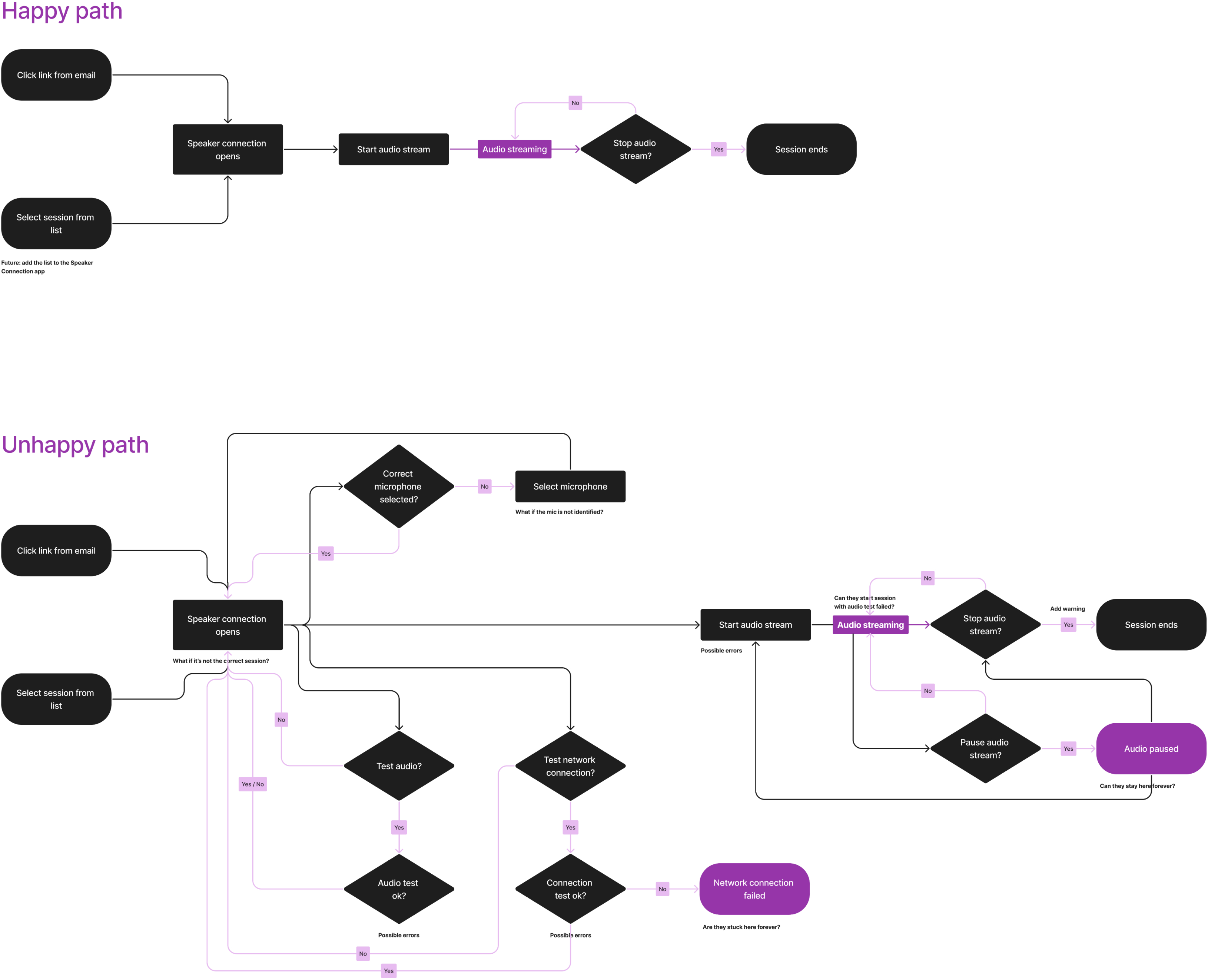
We started by analyzing the current experience. A test showed that 24% of live streams failed. The interface had usability problems too: important audio settings were hard to find, users couldn't tell whether their audio was streaming, and there was no straightforward way to recover when something went wrong.
The users had no reason to learn the product
We spoke with Customer Success managers and disability administrators at several universities, and also interviewed one lecturer, to understand how lecturers actually used the app. We learned that lecturers used it only occasionally and had very little tolerance for anything that added friction to their day-to-day work. They were willing to provide captions, but not to spend significant time learning or troubleshooting another tool.
That changed how I approached the project. I wasn’t just redesigning the interface; I needed to rethink the experience around occasional users who weren’t going to invest time in learning the system. I focused on three things:
- 1Making the default path effortless
- 2Making the streaming state unmistakable
- 3Helping users recover when something went wrong
If it was easy to do, okay, I would add it, no problem. But when it’s a pain in the neck? no way.

What going on? how do I know it’s happening? Then I came back two days later and it wasn’t there.
Meanwhile, I’m trying to have a class.
Make the simplest path the default
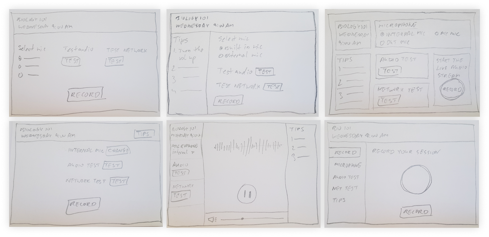
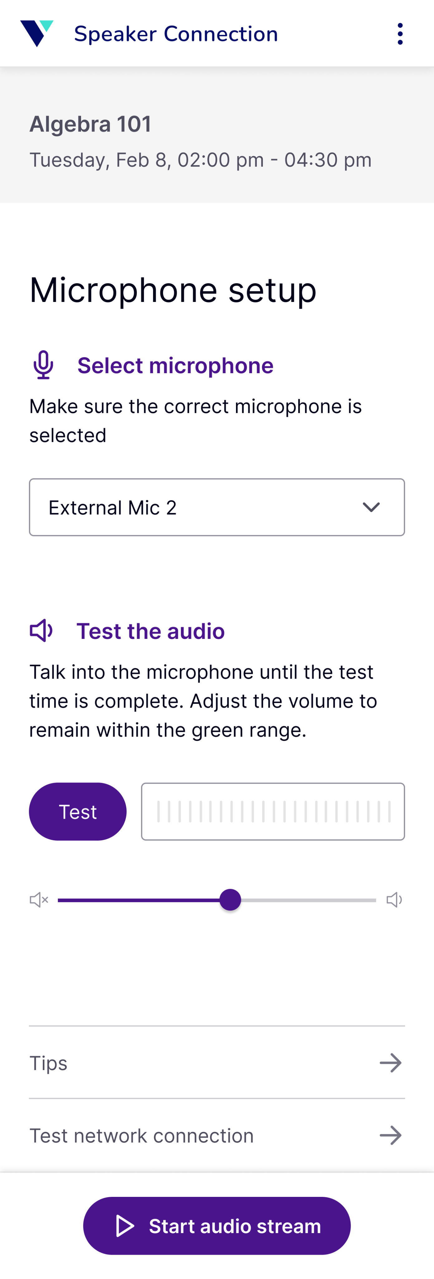
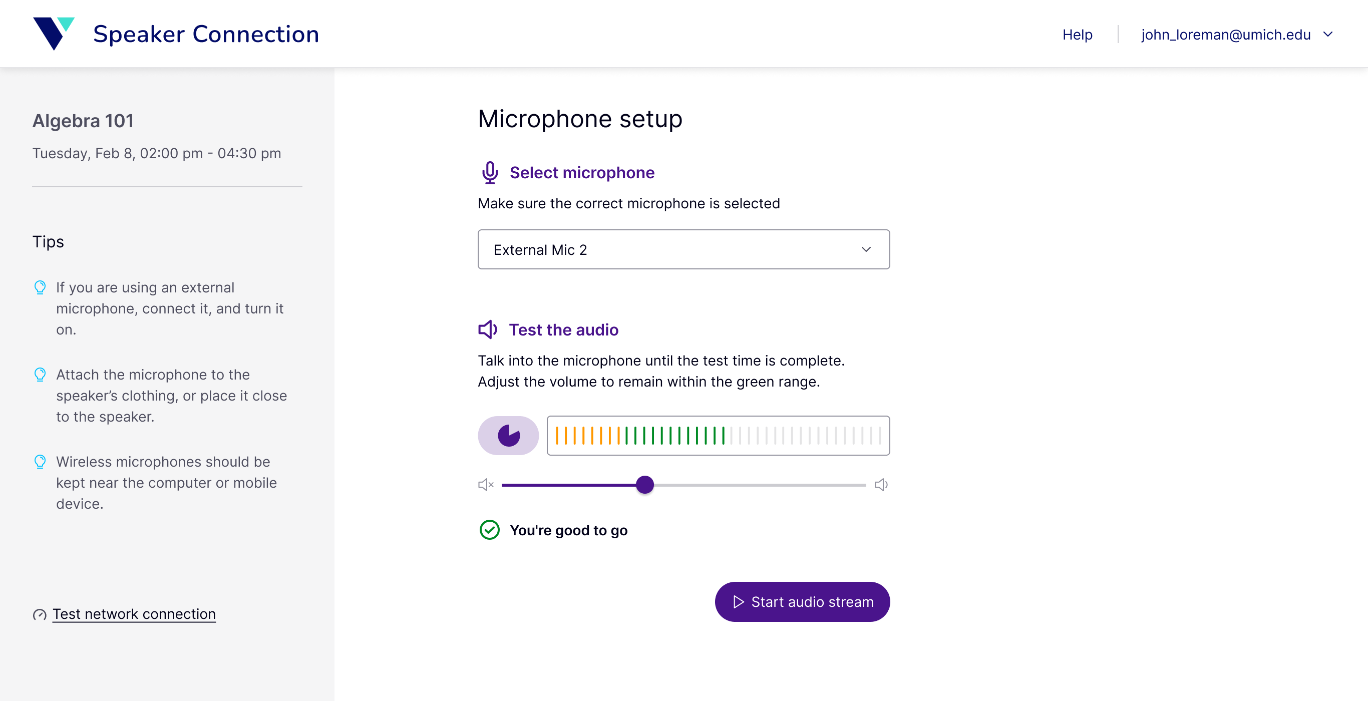
I used carefully considered defaults to make the simplest path effortless. The microphone was already selected, and users could start streaming with a single click. For users who needed to make adjustments, the controls were still there and easy to find. Options such as testing the audio, adjusting the volume, or checking the network were available without becoming part of the required setup.
Make streaming unmistakable, and a little more delightful
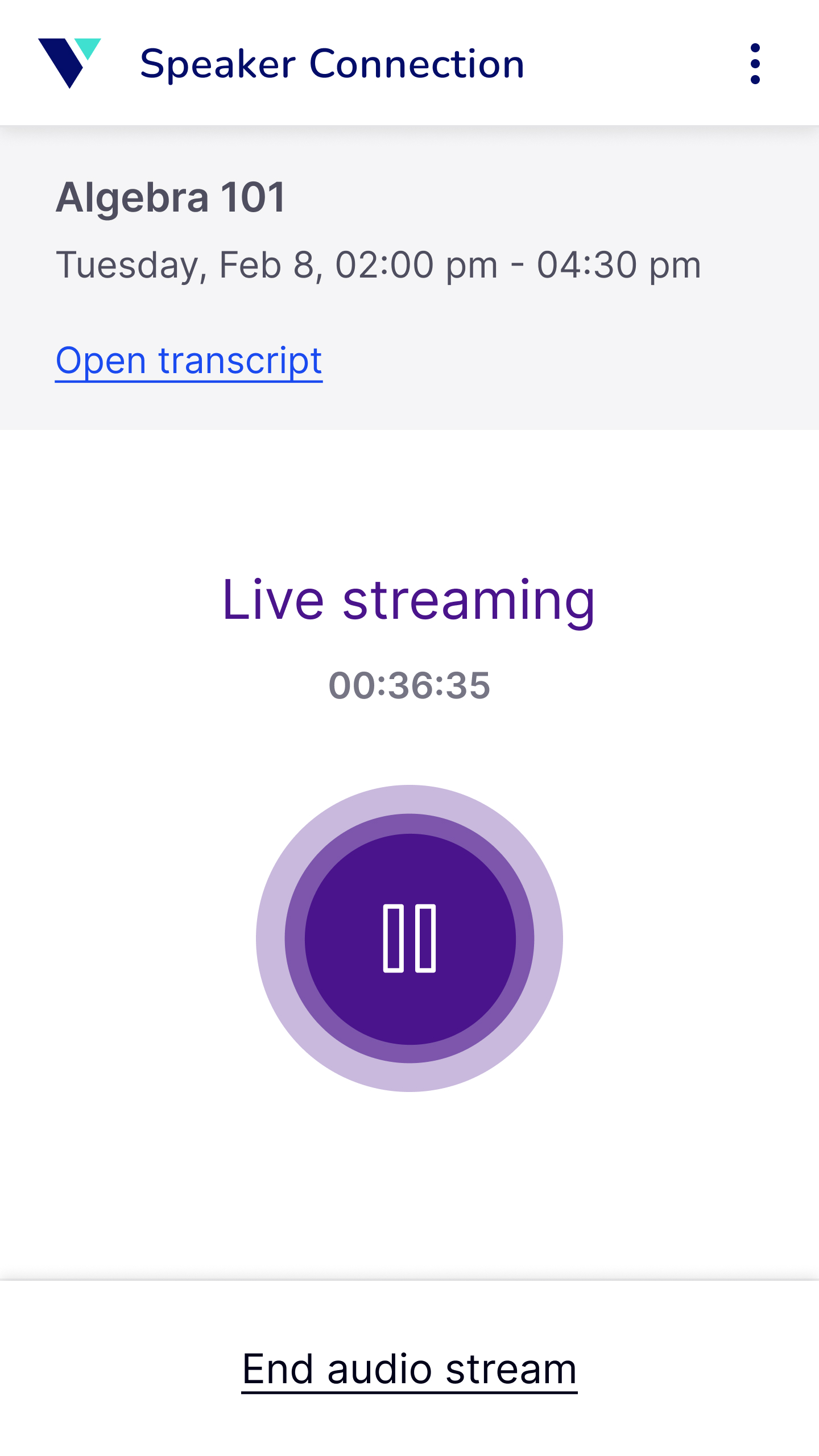
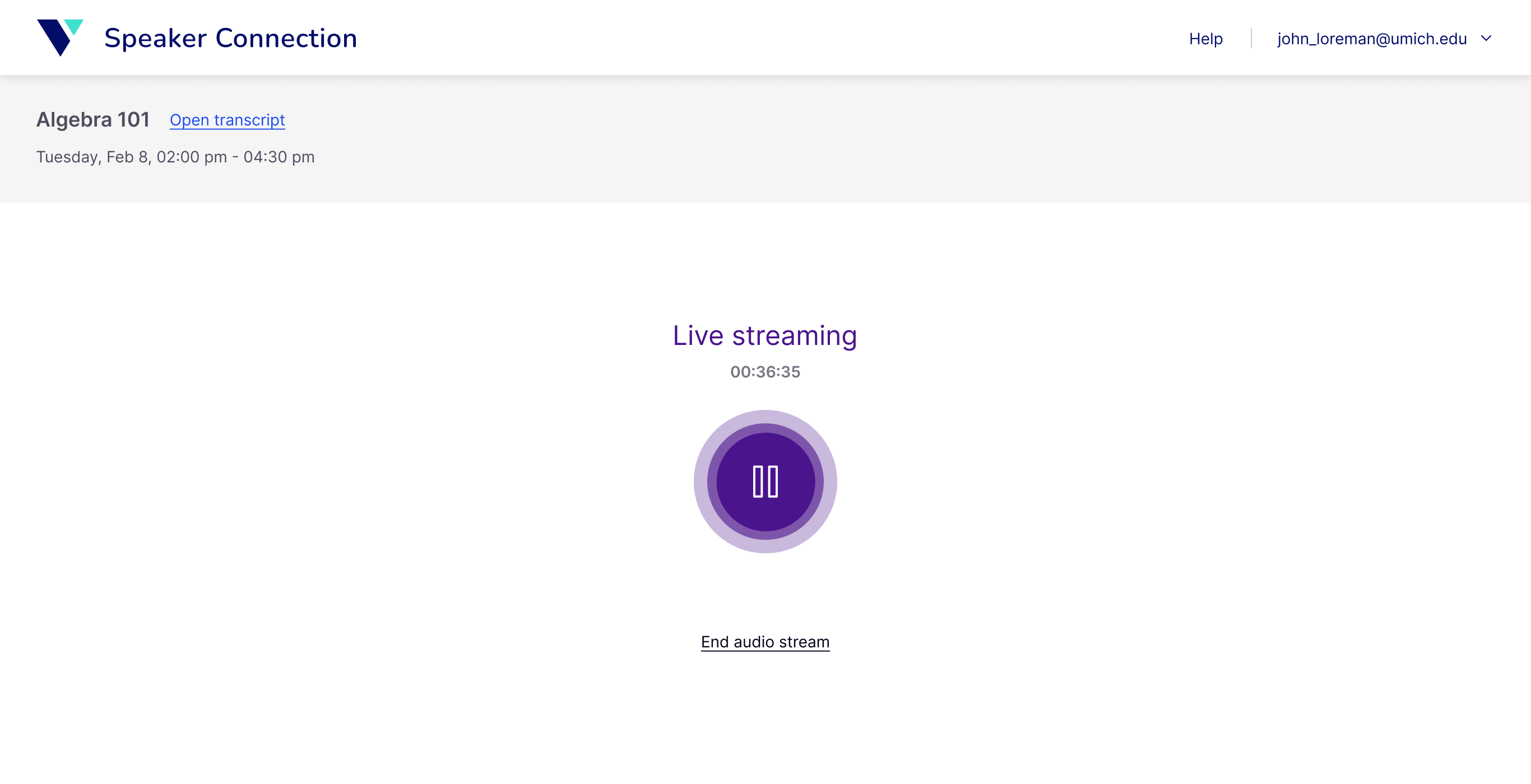
I designed the streaming state so there was no ambiguity about what was happening. The animated streaming indicator made it immediately clear that the audio was live, while adding a more engaging, polished feel to the experience. The timer and session information kept the user oriented throughout the session.
Help users recover
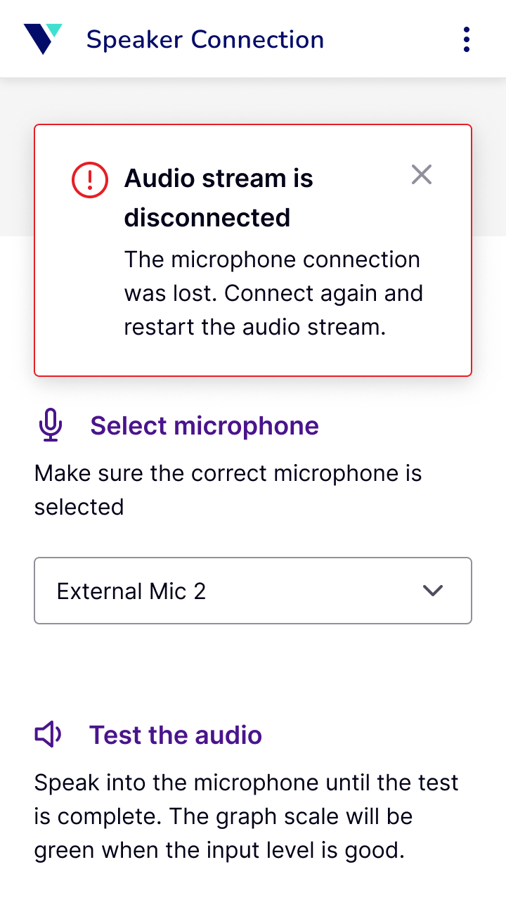
Technical issues could still happen, so I needed to make sure users weren’t left stuck when they did. I made errors easier to recover from by explaining what happened and what users could do next. Meaningful error messages helped them troubleshoot problems, while tips helped address common audio-quality issues.
The final experience
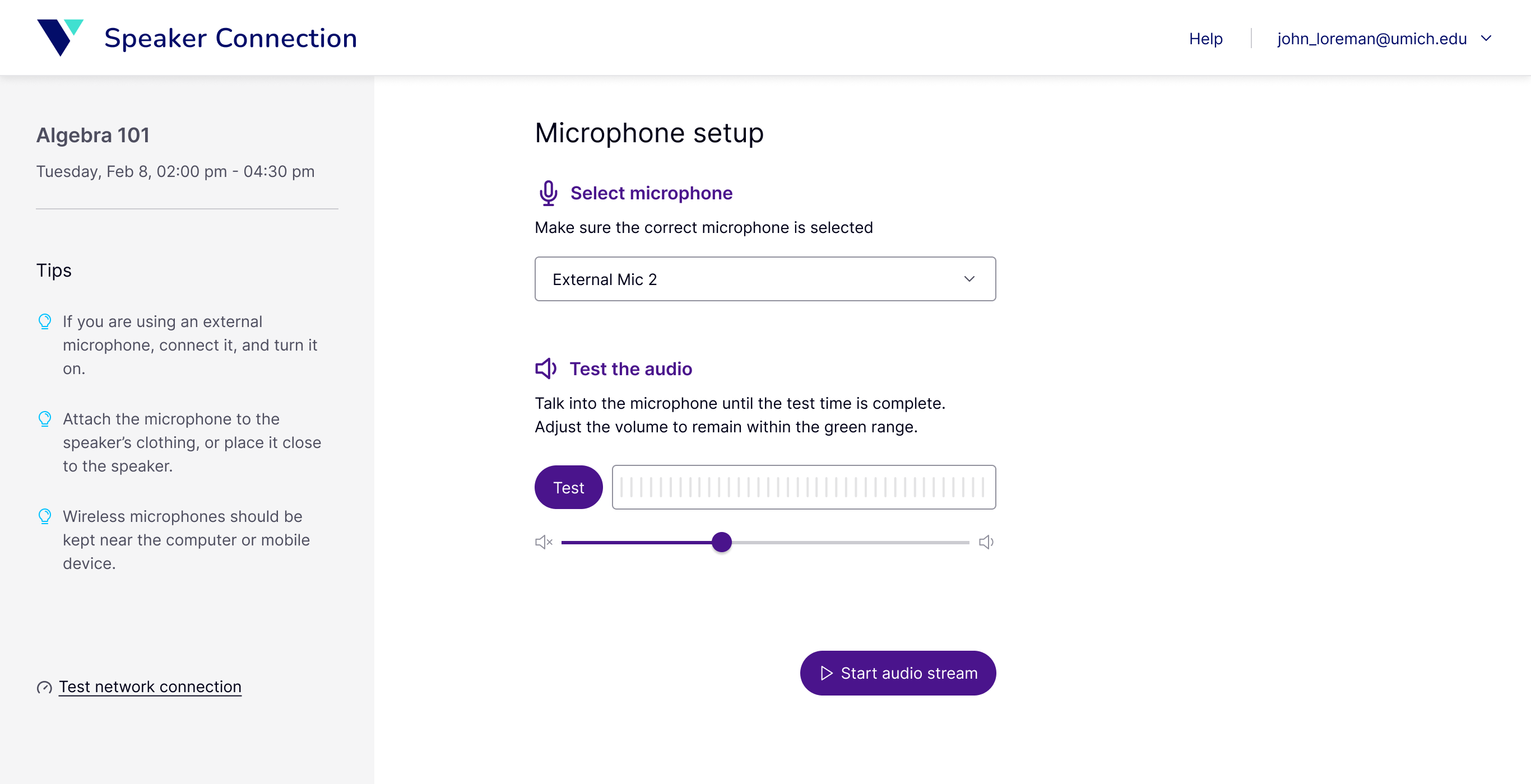
The main screen kept the full set of controls visible, while carefully chosen defaults let most users start streaming without changing anything.
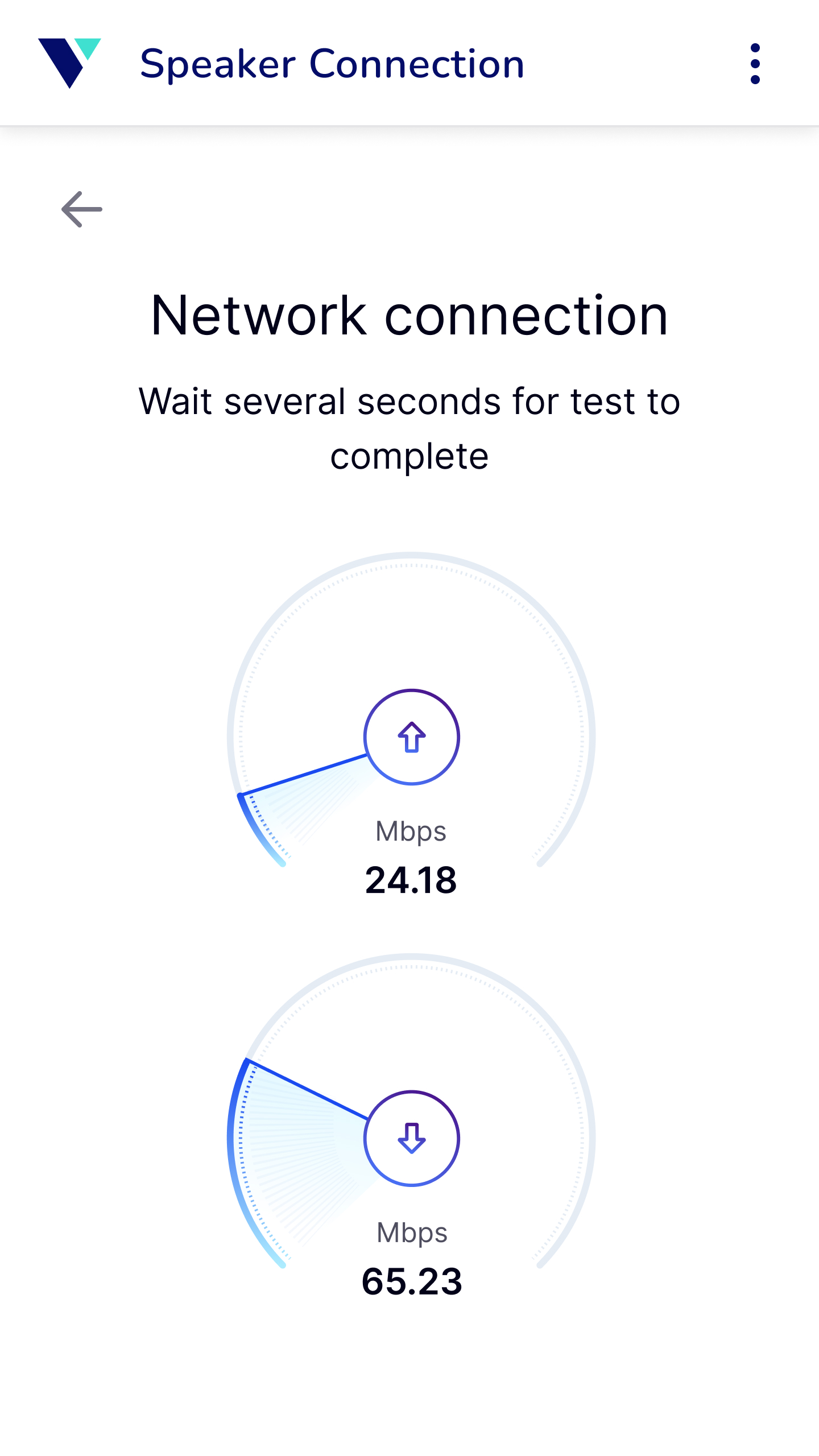
An optional network test gave users a quick way to check whether their connection was strong enough before streaming.