
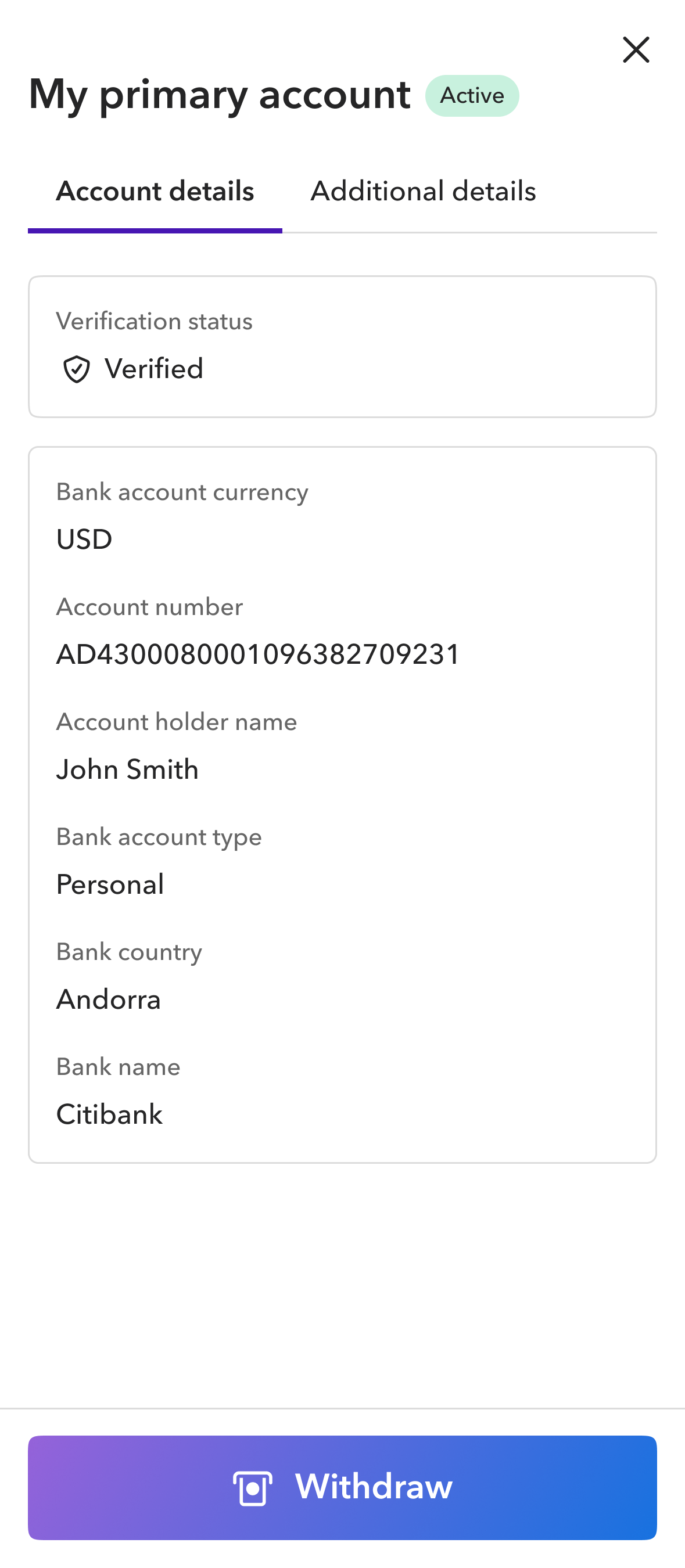
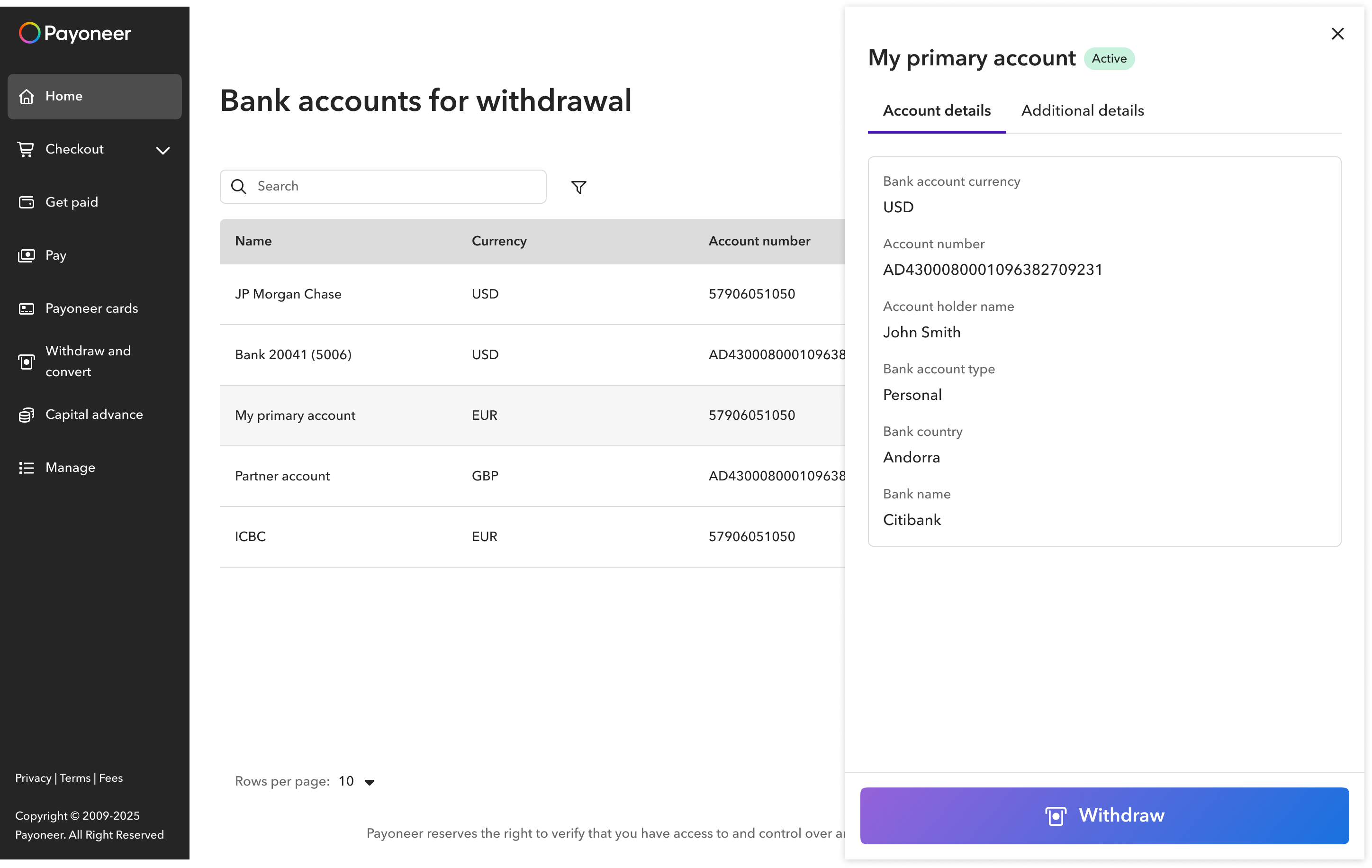
The finished video plays here.
Designing clarity into bank account management
What started as a design-system migration uncovered a deeper problem: the product’s complexity was leaking into the user experience. With fundamental changes out of scope, I focused on the improvements that could make the biggest difference.
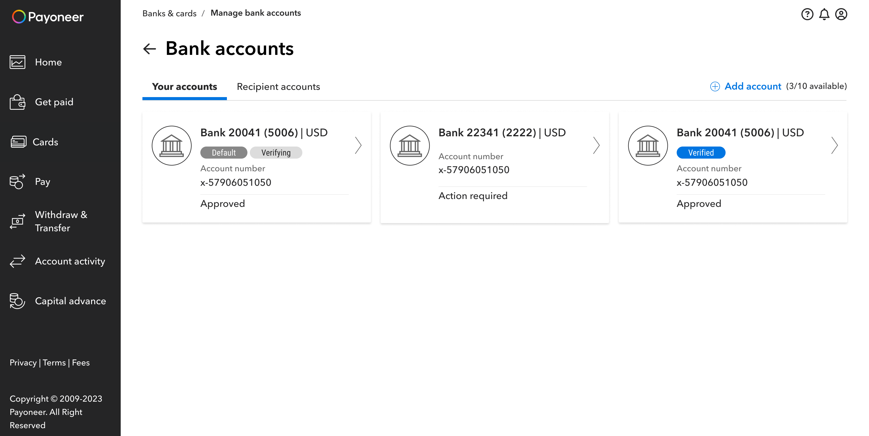
Visual migration uncovered something bigger
Payoneer’s Bank Accounts feature lets users manage the bank accounts connected to their Payoneer account. They can add and delete accounts, and verify them when additional verification or identification is required.
The project started as part of a broader migration of legacy modules to a new design system. The scope was limited to redesigning the existing experience using the new design system. As a result, engineering investment was limited, and fundamental changes to the product architecture, business logic, and structure weren’t an option.
Not every problem was worth solving (now)
As I started working through the existing experience, I uncovered several usability issues that went beyond the visual redesign. But we had to prioritize. We looked at how each problem affected the user experience and the effort required to improve it.
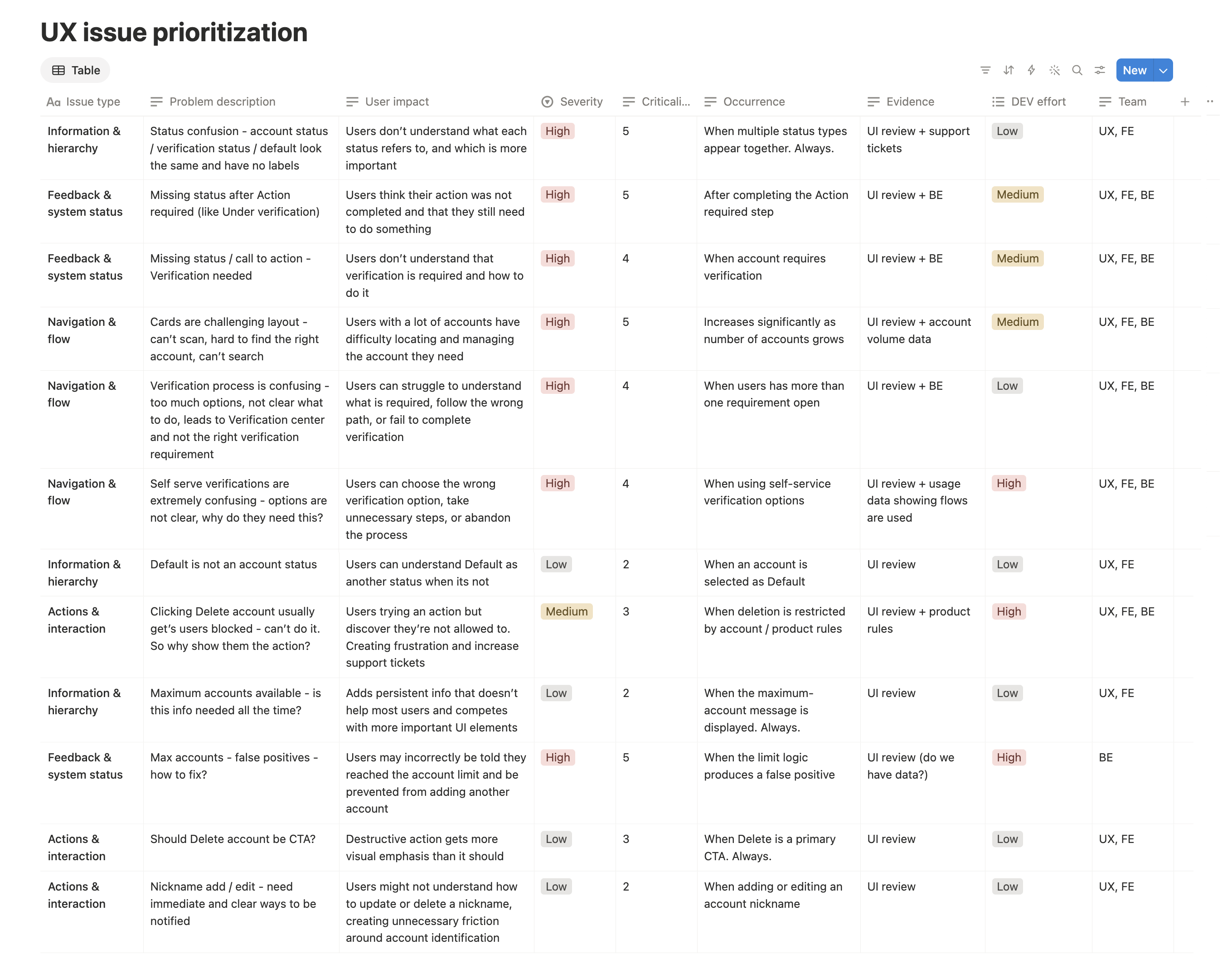
A complex product doesn't have to mean a complex experience
Looking across the problems we decided to address, the same pattern kept surfacing: too much of the product's complexity was being passed on to the user.
The challenge, then, was to keep that complexity in the product while the experience stayed simple and clear. Because I couldn't change the underlying rules, I focused on where the interface could absorb that complexity instead: making states and actions clear, choosing structures that could scale, and keeping conditional business logic behind a consistent user flow.
Statuses needed hierarchy and clearer feedback
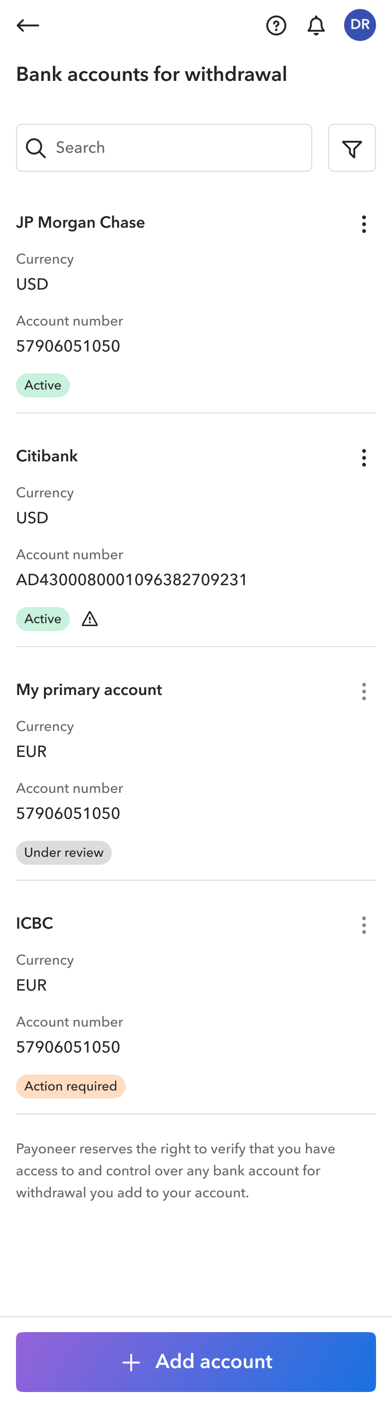
Each bank account could show three different statuses: the account status, the verification status, and Default, when the account was used for automatic withdrawals. They were presented in the same way, making it difficult to tell what each referred to or whether the user needed to act. Support tickets also showed that customers were asking what was happening with their accounts and what they needed to do.
I made the account status primary and displayed it as a colored chip since it told users at a glance whether the account was ready to use. We considered hiding the Active status to reduce the number of green chips for users with many accounts. I kept it because confirming that an account was in good shape gave users reassurance at a glance. Default wasn't really a status, so I moved it below the account name as secondary text.
Verification was different. An account could be Active while still requiring verification. Not every user needed verification, and for those who did, verifying one account was enough. I initially treated it as a secondary status, but an internal guerrilla test showed that participants were confused about why they had two statuses and whether they needed to act.
I explored showing verification as an action, such as Submit documents, but design system constraints ruled that out. Instead, I displayed a warning icon only when action was required. Clicking it explained why verification was needed and led into the verification process.
I also found gaps in how progress was communicated. After users submitted documents, the account still showed Action required, so I added an Under review status to show that their part was complete. Verification had a similar problem, and the warning icon helped solve that gap. A pending icon then showed that Payoneer was reviewing the submission, and a checkmark confirmed completion.
A second internal guerrilla test showed that the distinction was much clearer. Participants could tell when something required their attention, what to do next, and where they were in the process.
The structure had to work for 1 account or 100
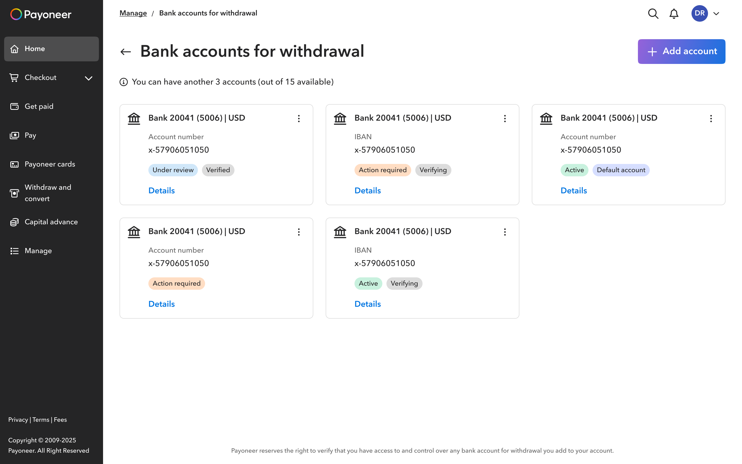
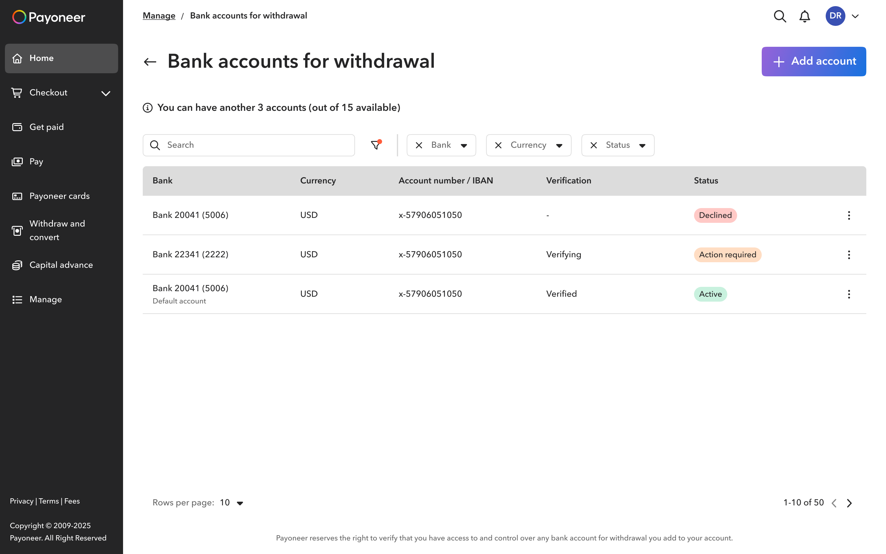
The previous card layout worked well enough for customers with one or two accounts, but became harder to scan and manage as the number grew, with no adequate search or filtering. Account-volume data showed that relatively few customers had more than three accounts, which made the decision less obvious.
Keeping cards would have worked for the majority, but meant accepting a poor experience for customers with many more accounts, in some cases close to 100. Instead, I looked for a structure that could serve both groups.
A table provided a more scalable foundation, with search, filtering, and sorting built into the experience. I chose it because it could serve both users with a few accounts and those with many, and continue to work as the number of accounts changed.
One verification task was split across 10+ flows
What looked like a single task, verifying a bank account, was split across more than 10 user-facing flows. The path depended on rules such as account eligibility, permissions, available verification methods, and what the customer had already done.
Those rules were necessary, but exposing them through separate flows made the product's internal logic part of the user experience. It also created overhead for the team, since each flow required its own design, content, development, and QA.
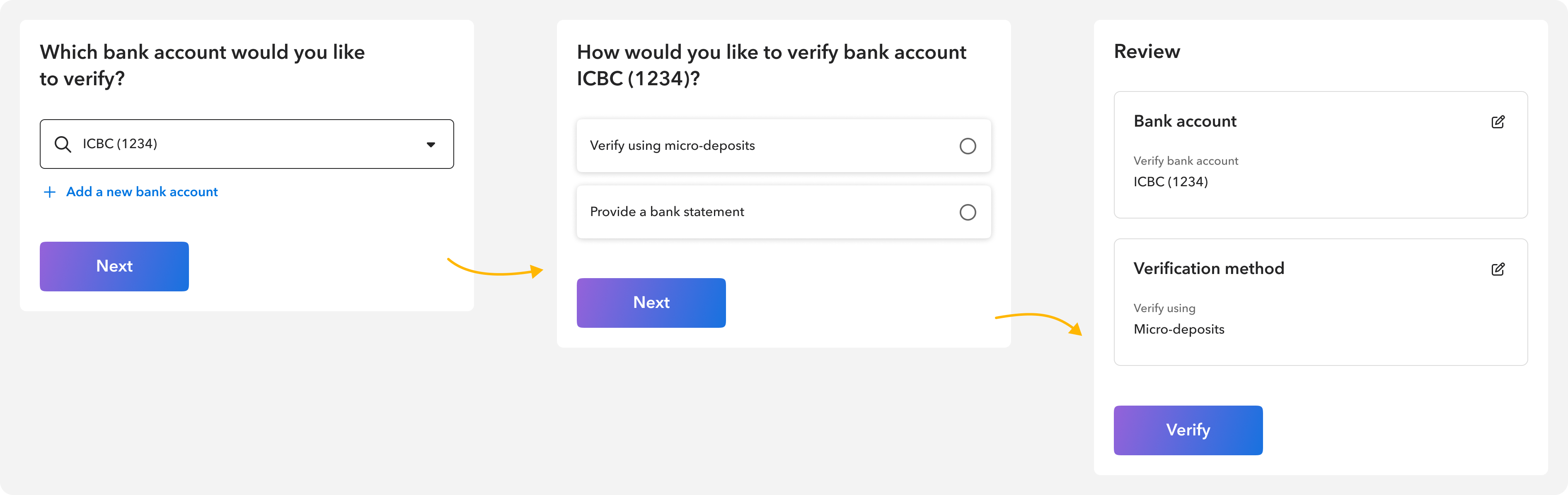
I consolidated them into one consistent three-step flow: choose a bank to verify, choose a verification method, then review and complete the process. Small variations within the flow handled the different scenarios, reducing the effort to build and maintain the experience without changing the business rules.
The final experience
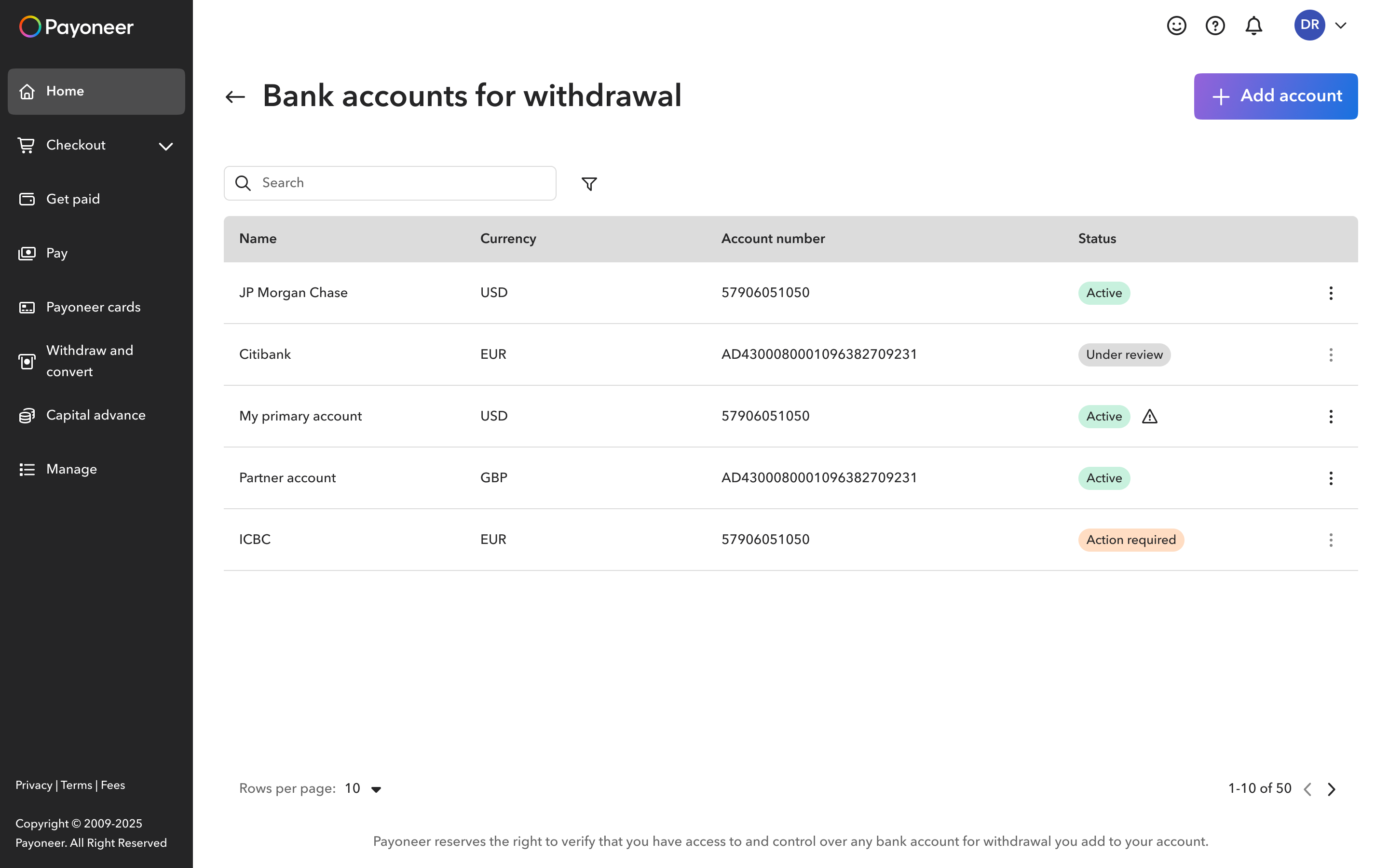
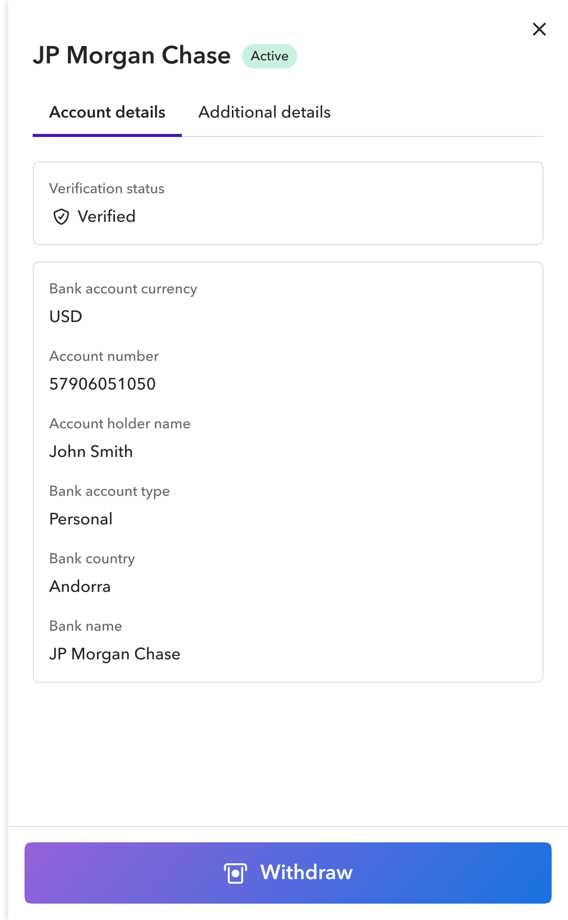
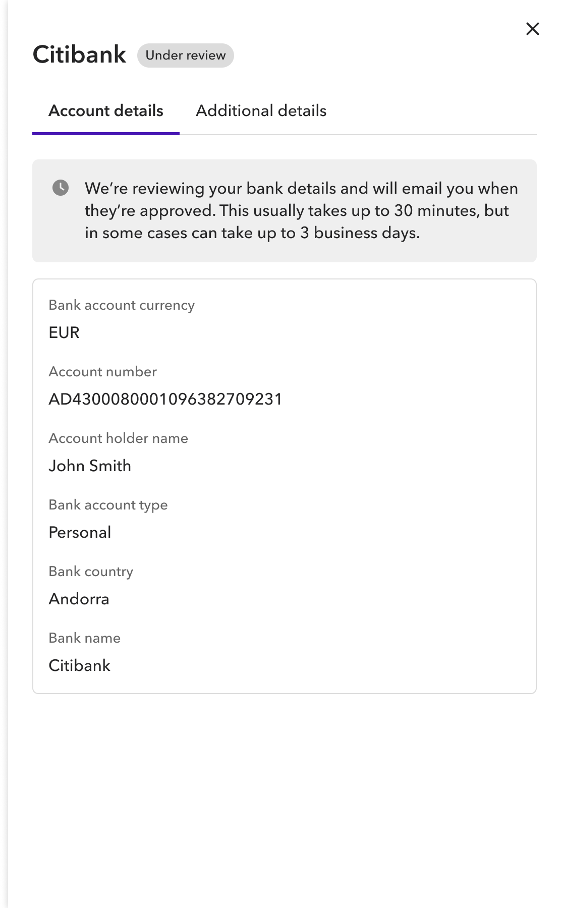
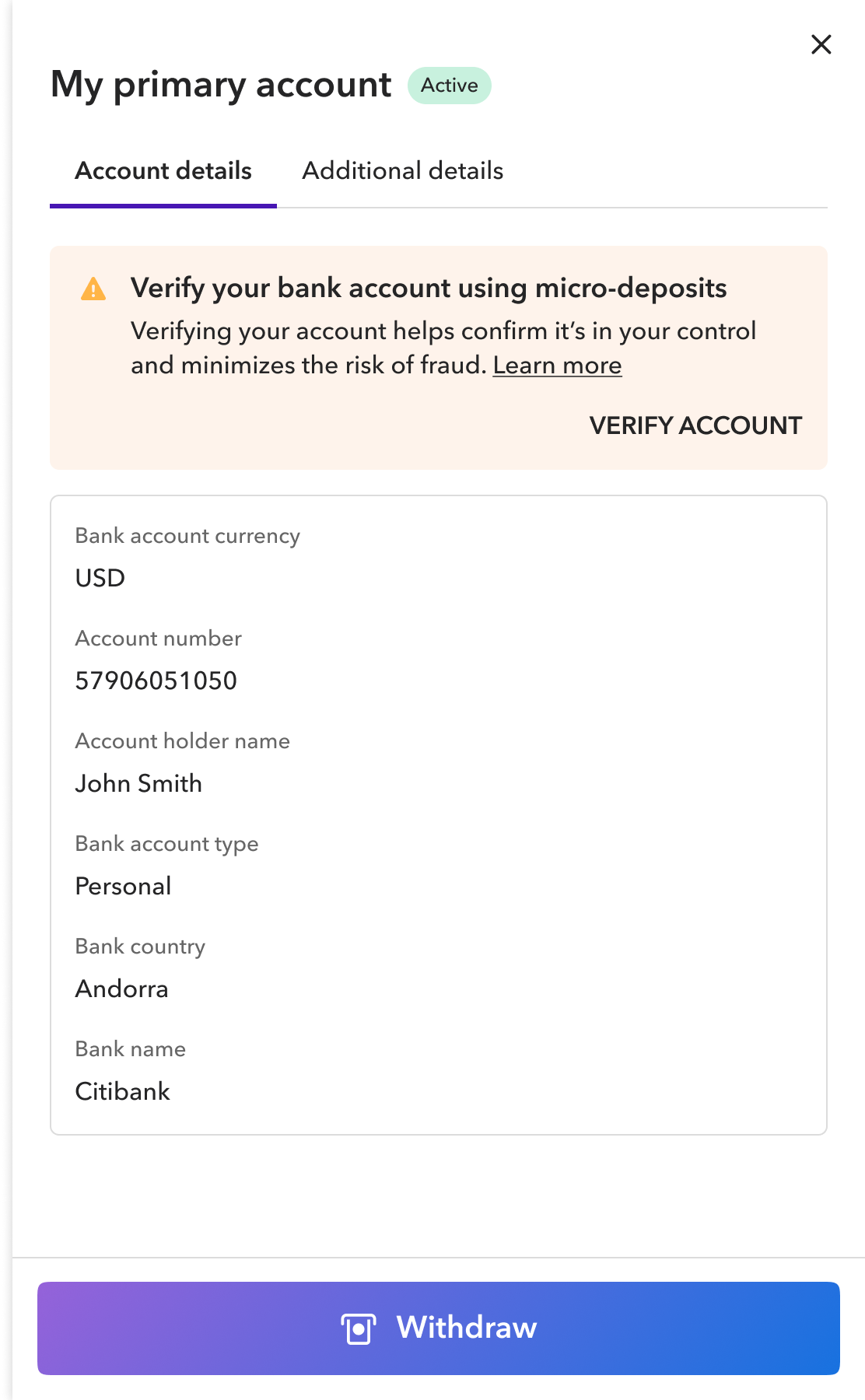
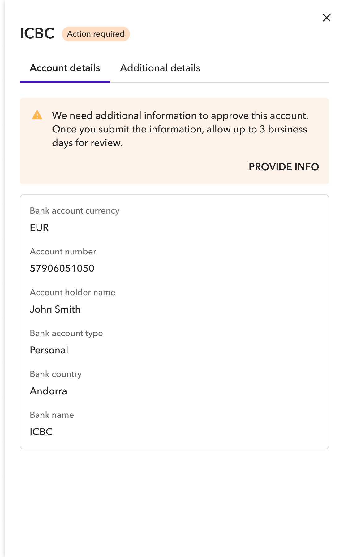
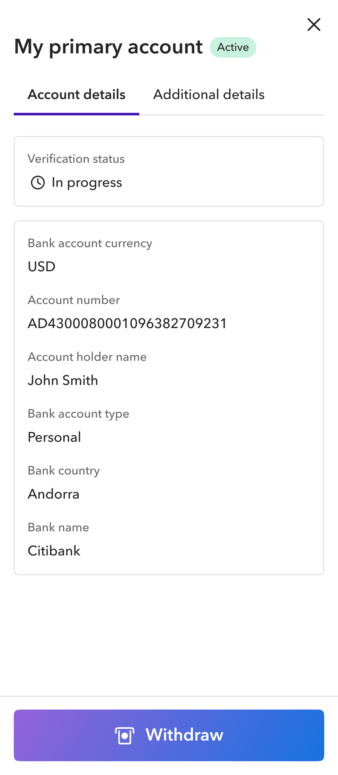
An account could remain Active while verification was still in progress, with each status clearly communicated.
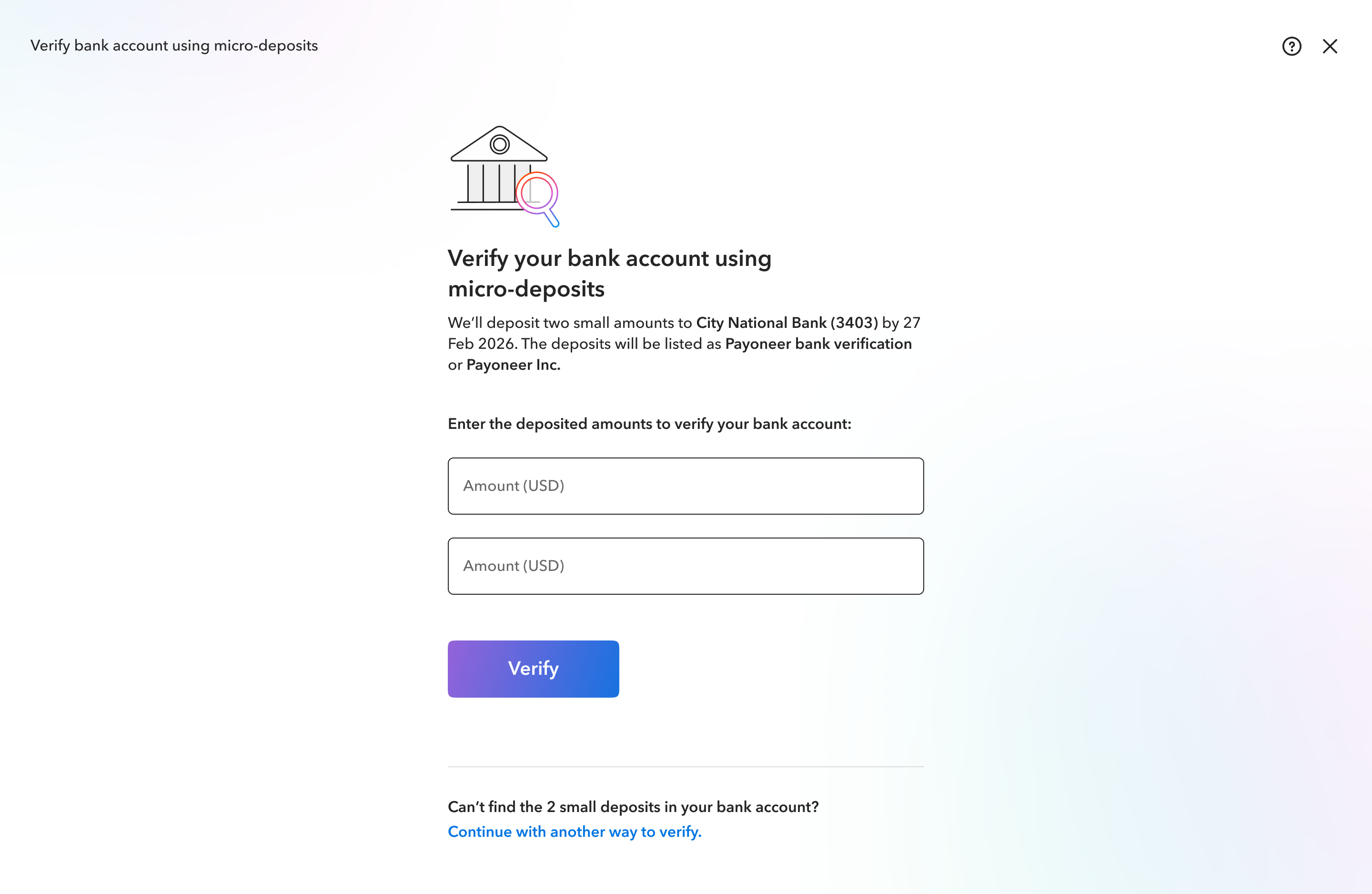
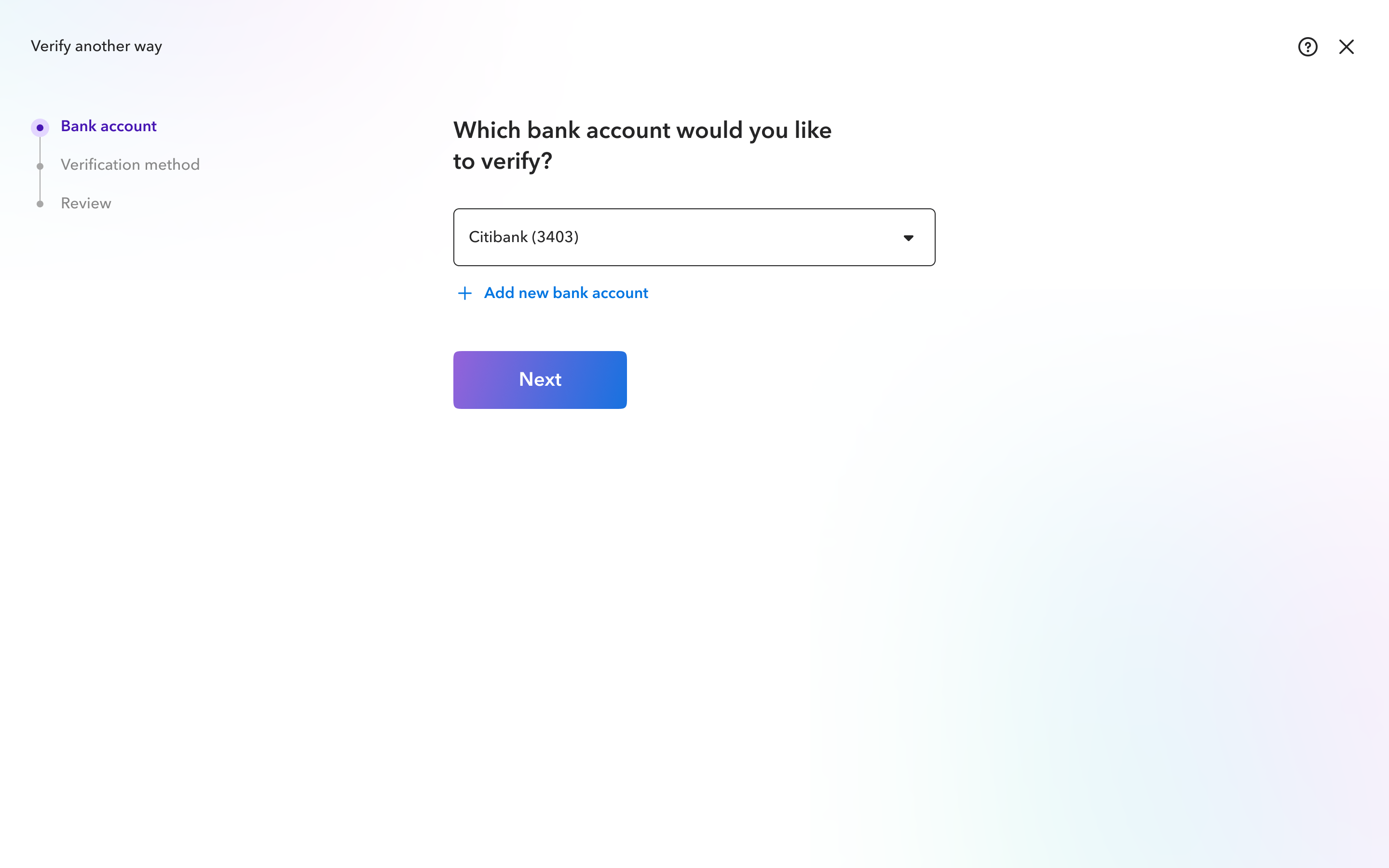
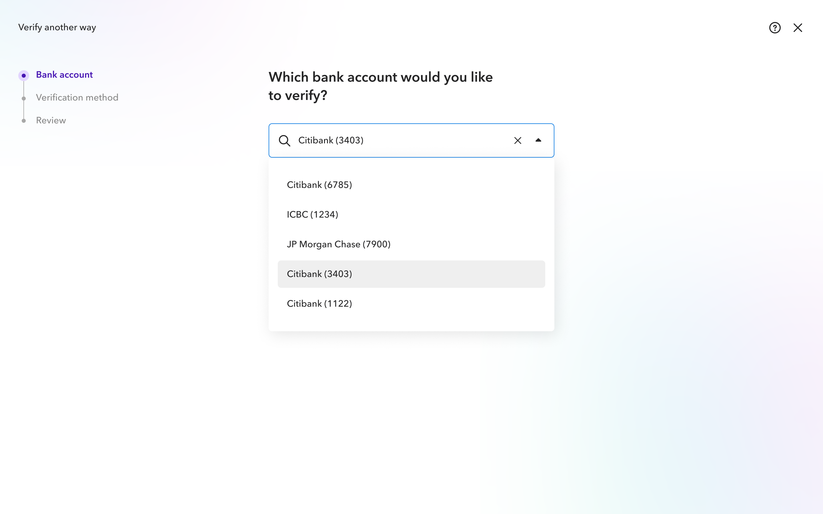
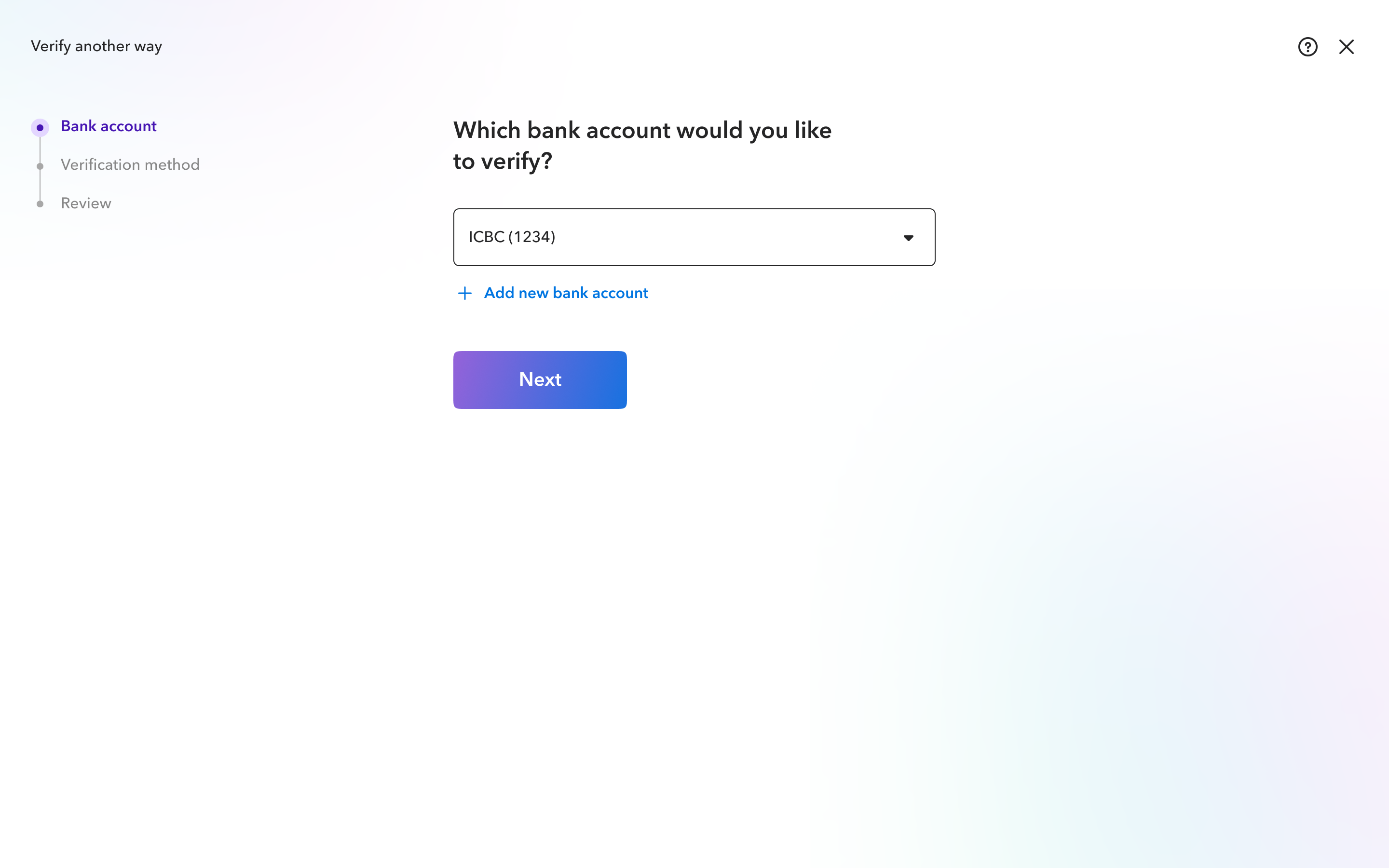
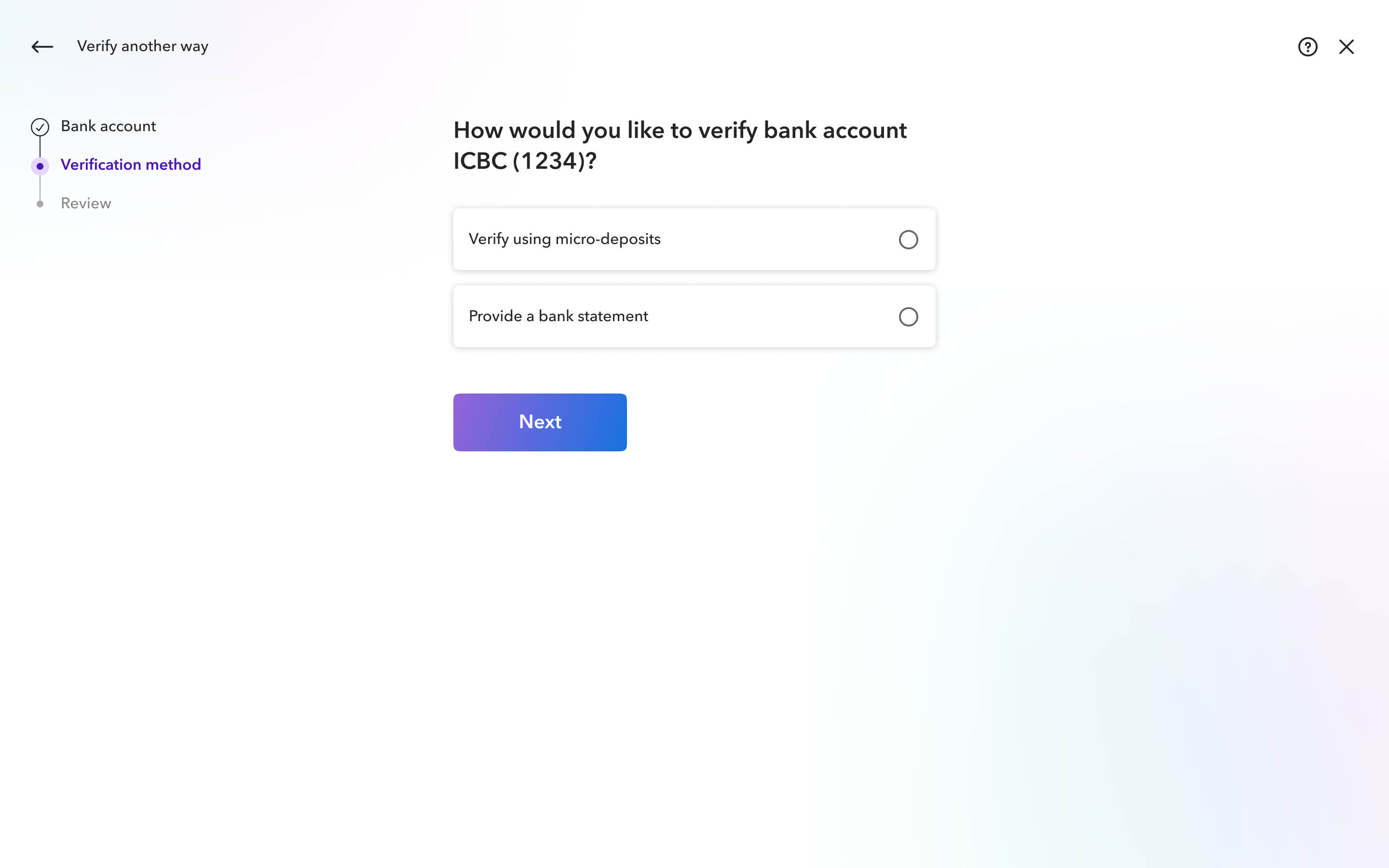
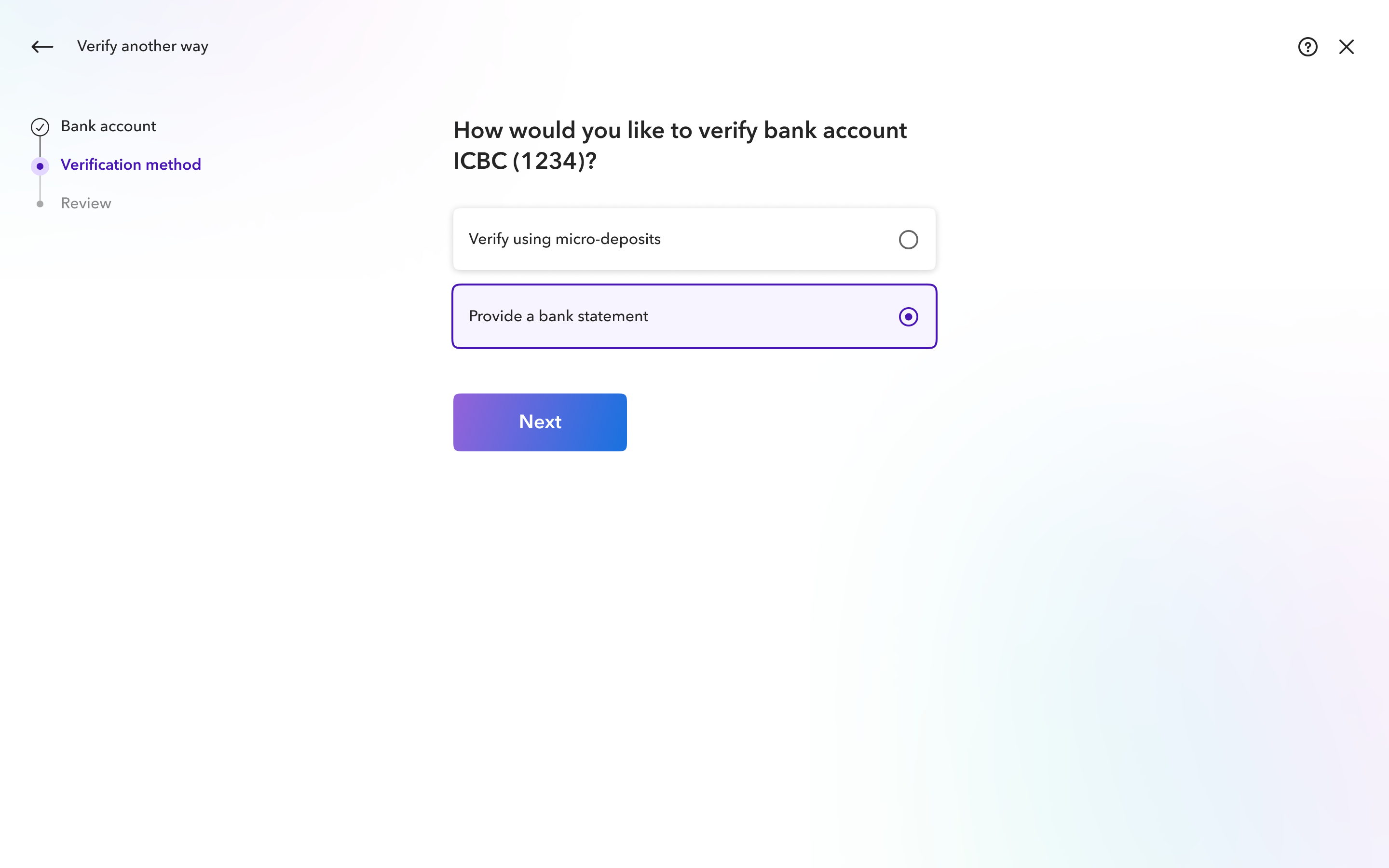
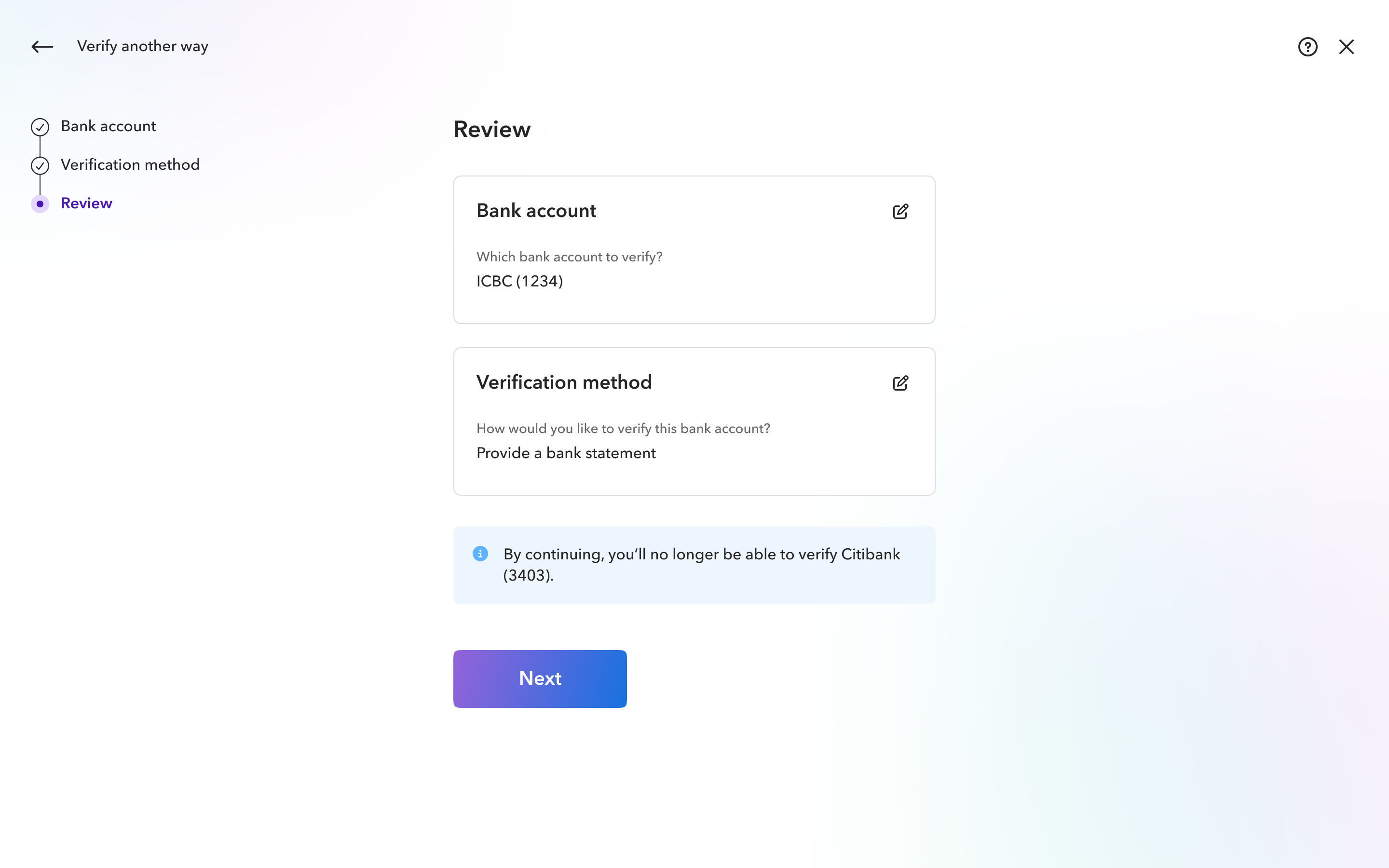
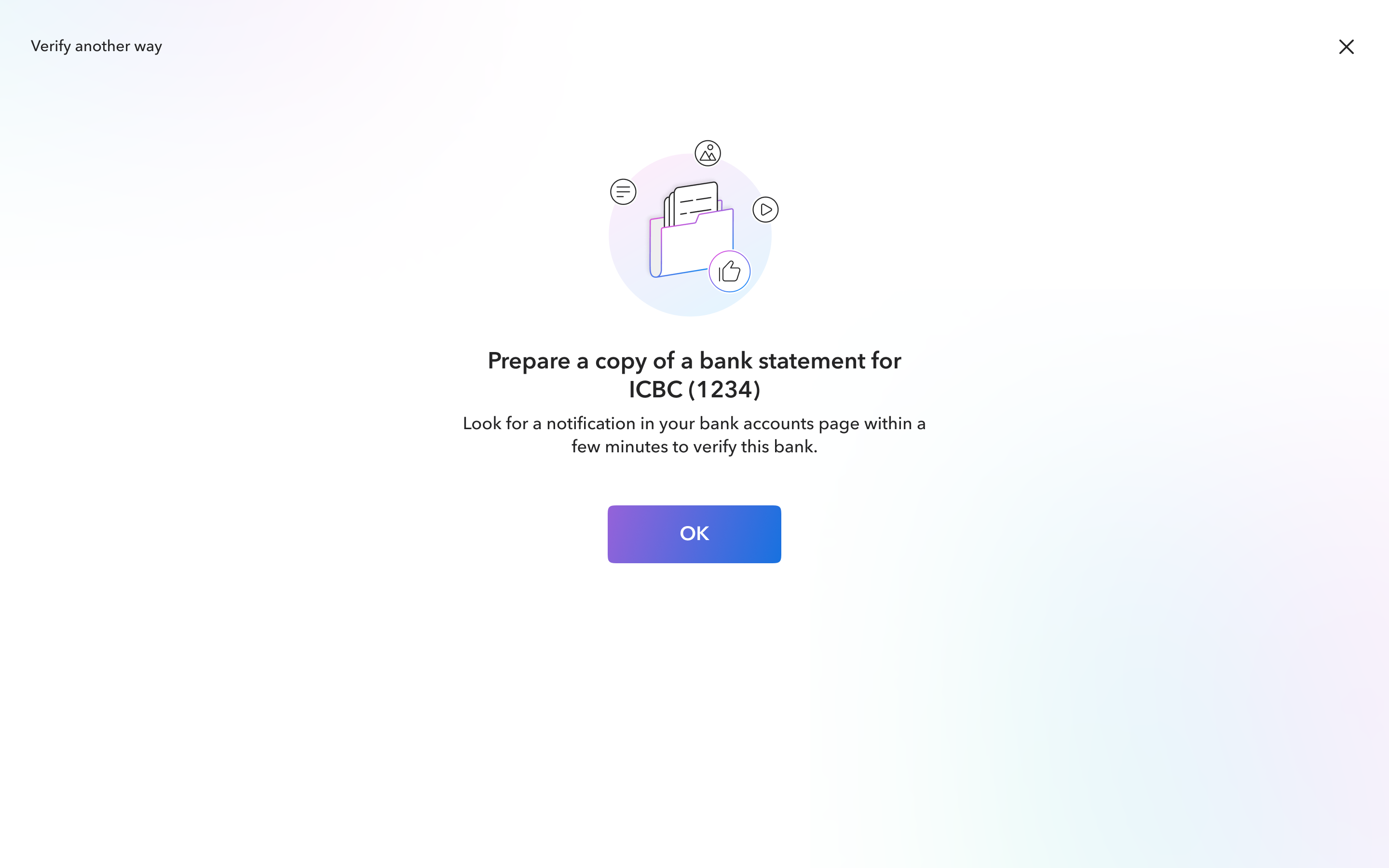
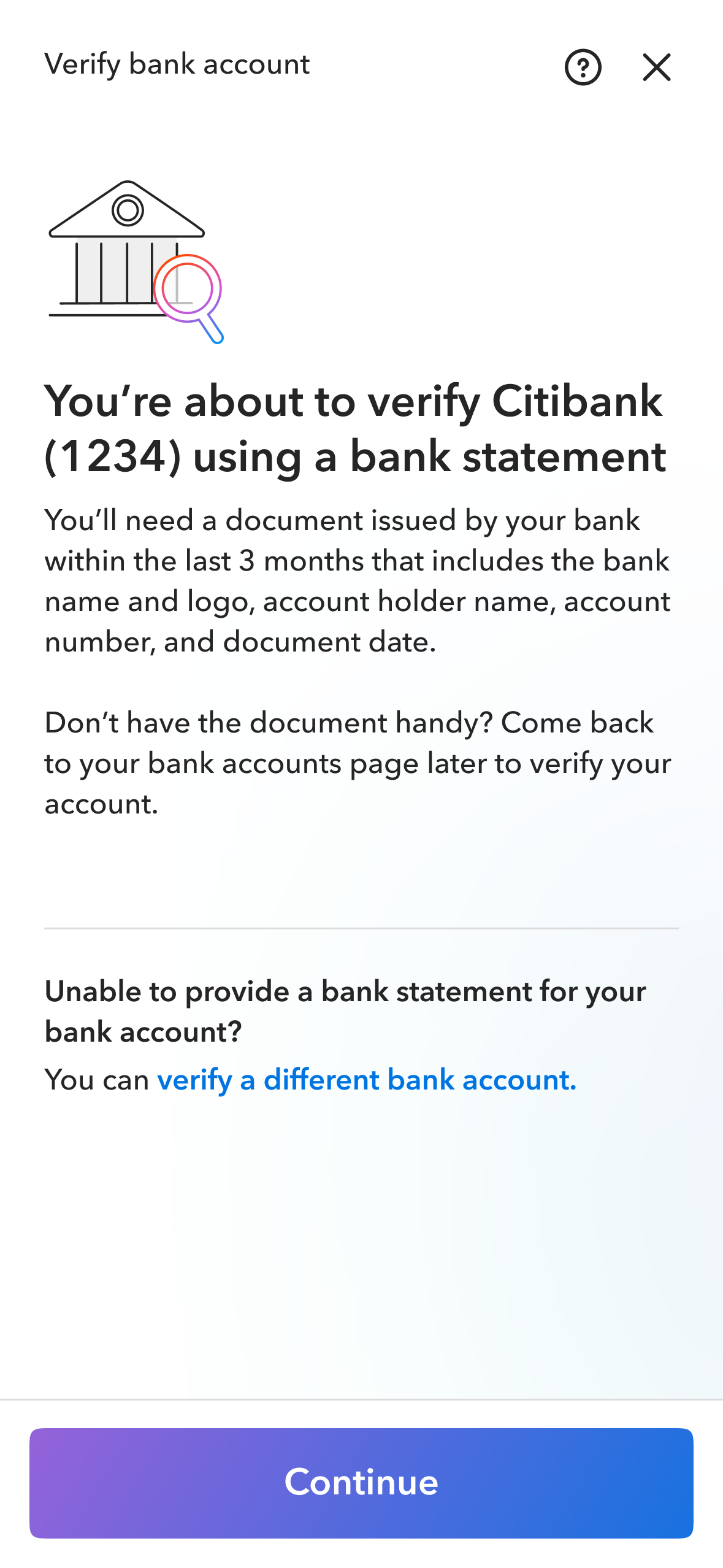
Bank statement verification with a clear fallback to other verification methods.
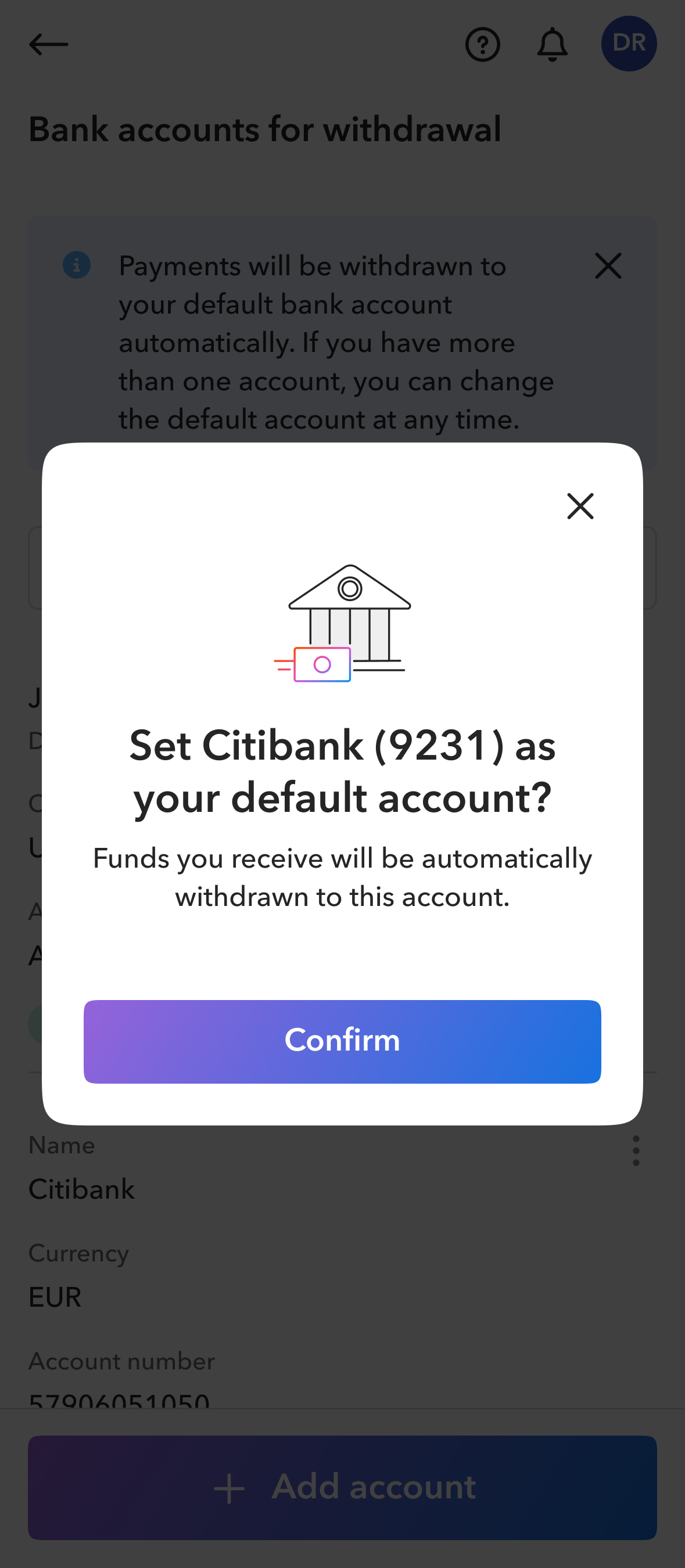
Confirming the default account before automatic withdrawals are redirected.
Improved engagement and reduced support
31%increase
In engagement with adding a
bank account among active users
64%reduction
In bank account support tickets overall
- 77% reduction across six key issues
- 81% reduction in verification-related issues