


The finished video plays here.
Unifying complex ordering workflows
The core concept worked, but it didn’t match users’ mental models
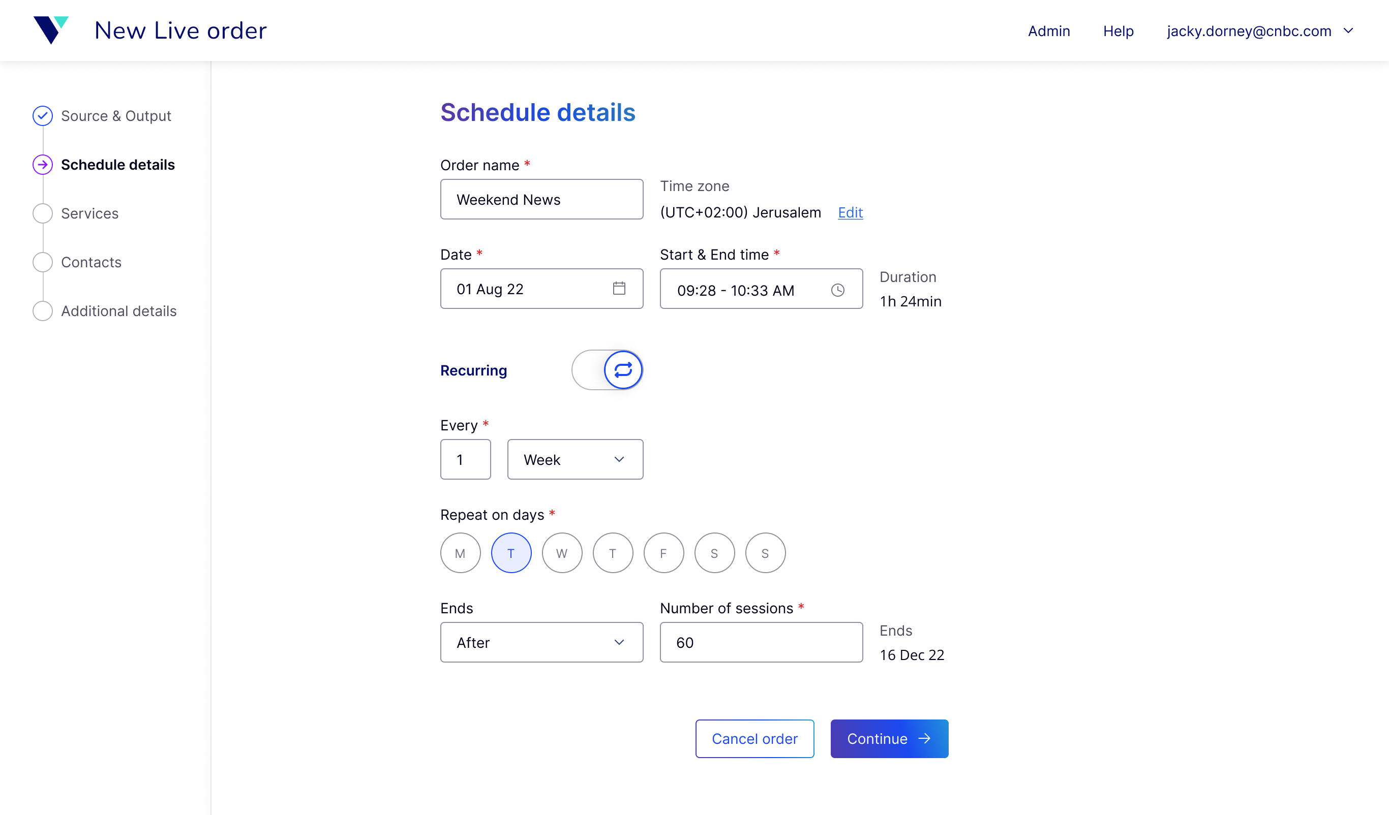
Verbit had several transcription and captioning services, each with its own way of scheduling sessions. The goal of this project was to create one ordering experience where users could request captioning for online meetings, lectures, TV broadcasts, and other live events, while supporting different customers, services, and use cases
I joined a few months in, with the core concept already defined: a table for managing sessions and a wizard for creating new ones. The structure made sense, so I focused on what could be improved.
The first round of usability testing revealed a mismatch between the flow and users’ mental models. Instead of asking users to learn the system’s logic, I reorganized the flow and adjusted the terminology to better match how they expected the process to work. In the next round, users completed the tasks successfully and were able to use the product without any training.
A long flow didn’t have to mean more work for users
Despite the usability results, the length of the wizard raised concerns internally. I analyzed customer data and usage patterns, to find where the system could do more. My goal was to reduce mental effort without removing required information.
80% +of sessions
Repeated the same selections
For most sessions, only the name, date, and time changed. I designed the flow to remember previous selections and use them as defaults. The same finding also led me to explore reusable session templates.
60%of all users &
100%of Media users
Had information they didn’t need to revisit
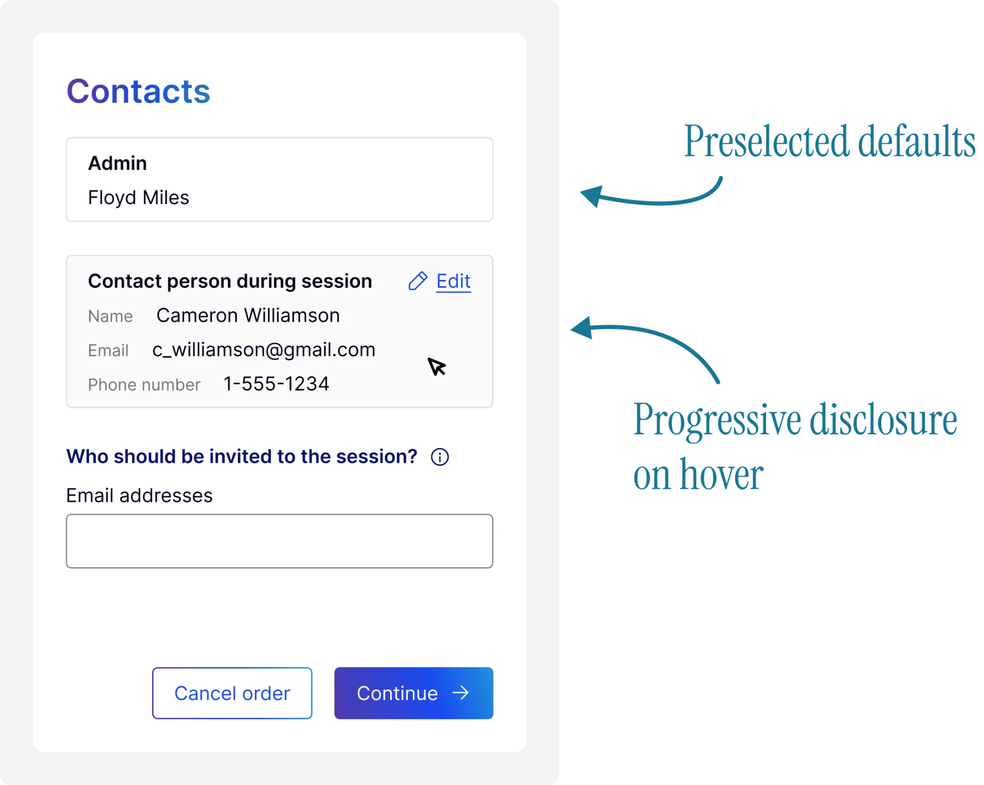
Some information needed to be available, but not necessarily visible upfront. Defaults and progressive disclosure kept it accessible without making users deal with it every time.
85%of users
Had unnecessary fields
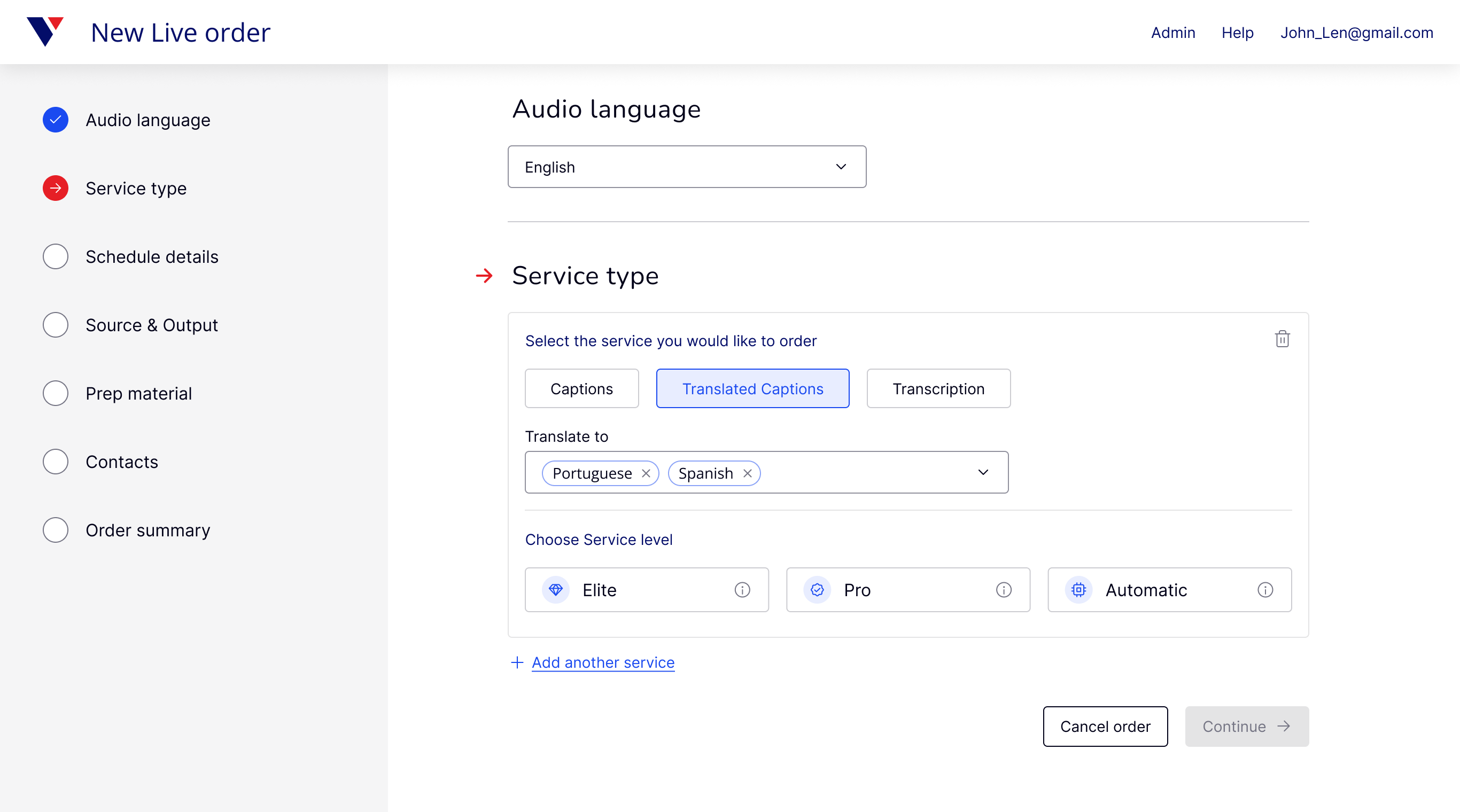
Some fields could disappear entirely. If a customer only purchased English captions, for example, there was no reason to ask the user for a preferred language every time.
Adding Media put the idea of one shared experience to the test
The next challenge was bringing Verbit’s Media vertical, its biggest source of income, into the same experience. Media used different technology, followed a different process, and was managed in its own system.
I worked with domain experts to understand the Media workflow, map its requirements and constraints in detail, and design a version of the wizard around them. From there, I explored several approaches to fit Media into the broader experience, including multiple accounts, a dedicated flow, and asking users to choose the type of session upfront. None felt like a clean fit. The first two would keep Media separated, while adding another decision to an already long flow would increase cognitive load and the risk of mistakes.
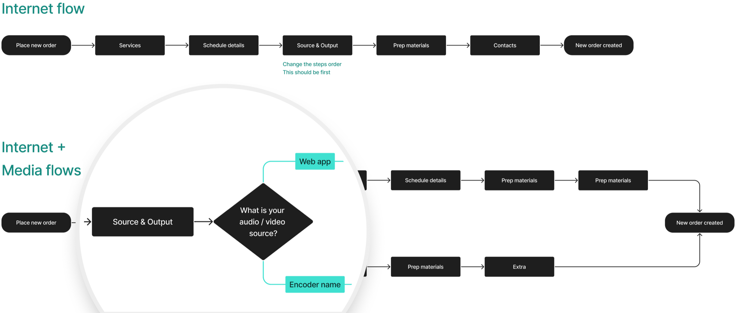
The answer was already in the flow
Looking across my analysis, I found another approach. Instead of asking users to choose a path, I could base it on a choice they were already making. Later in the wizard, every user had to select an Audio / video source for their session, such as a meeting app, microphone, or media server. That practical choice could also tell the system which path to follow, Internet or Media. Moving it to the first step meant users could make a familiar choice, while the system handled the branching behind the scenes.
The change looked simple in the interface, but it challenged the existing separation between Media and Internet workflows. I validated the approach with stakeholders and domain experts before moving forward.
The final experience
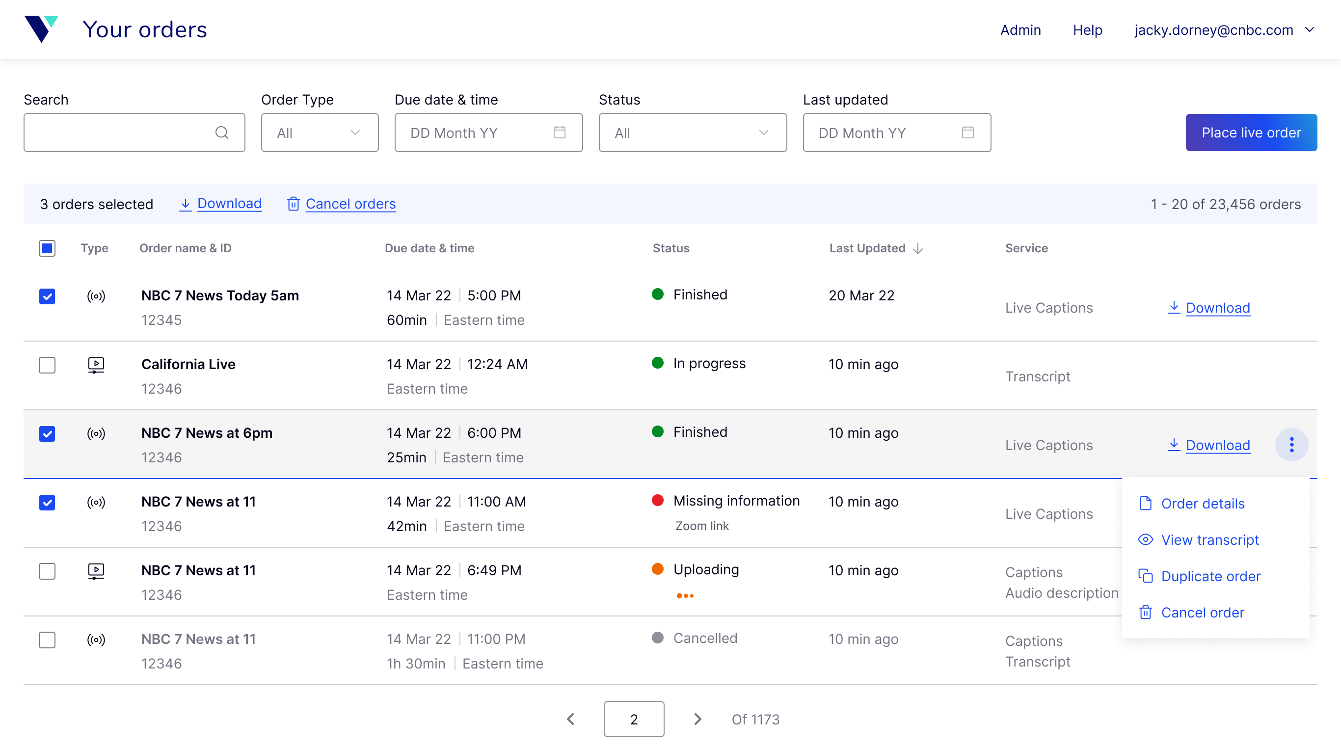
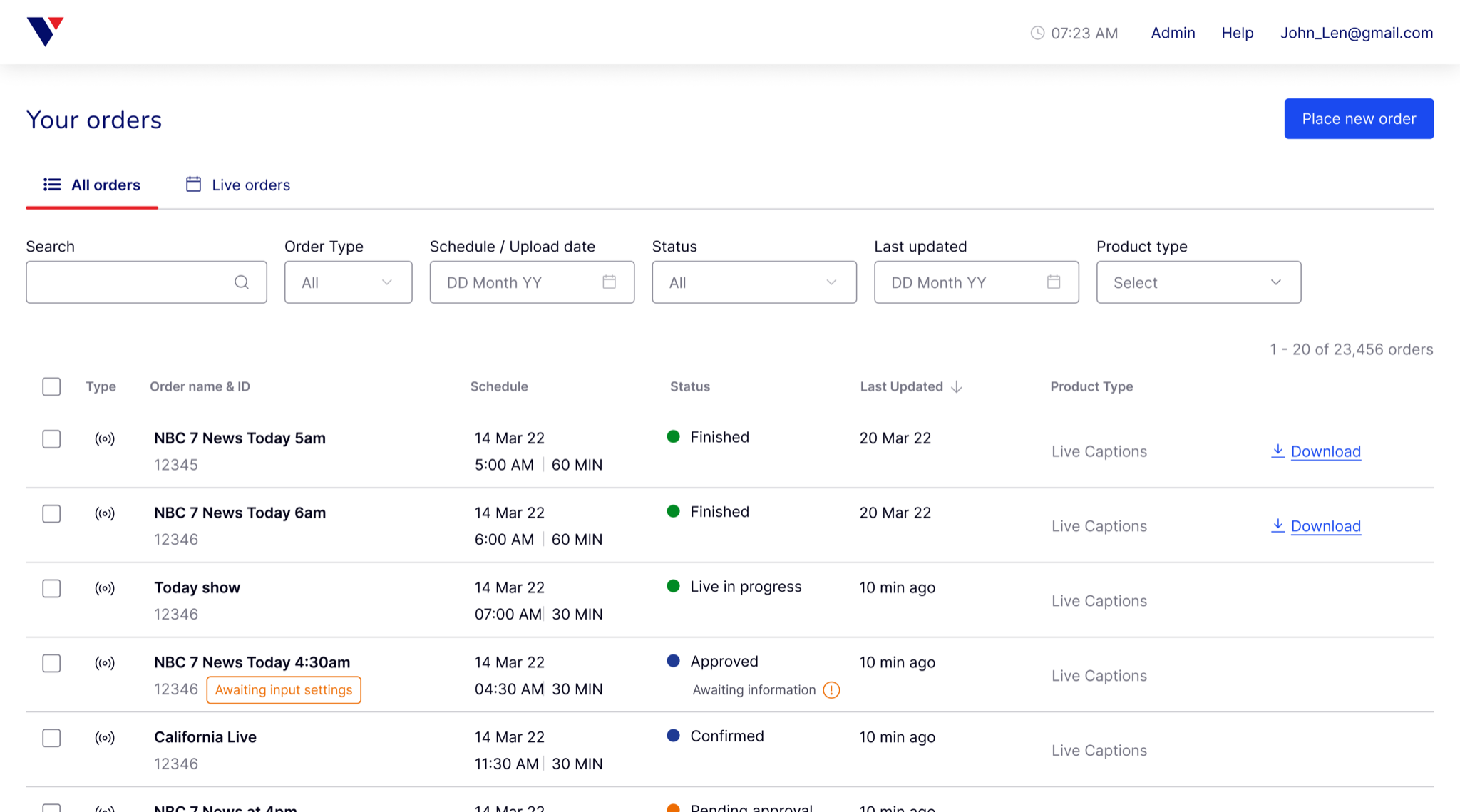
A single view for managing different order types, statuses, and services.
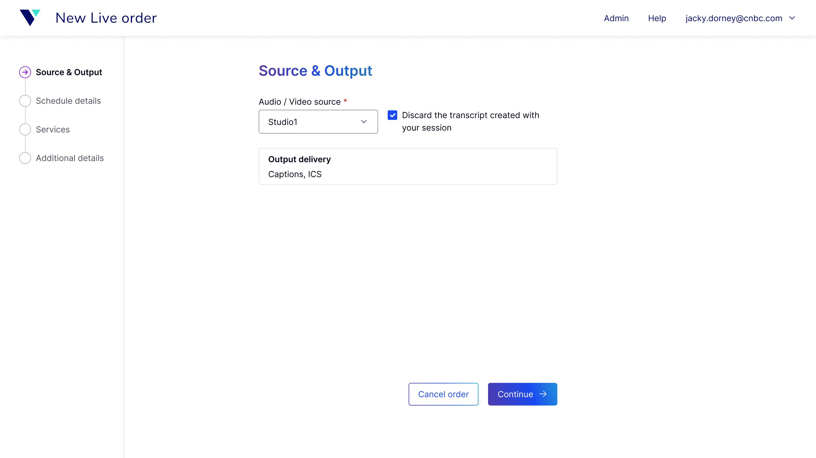
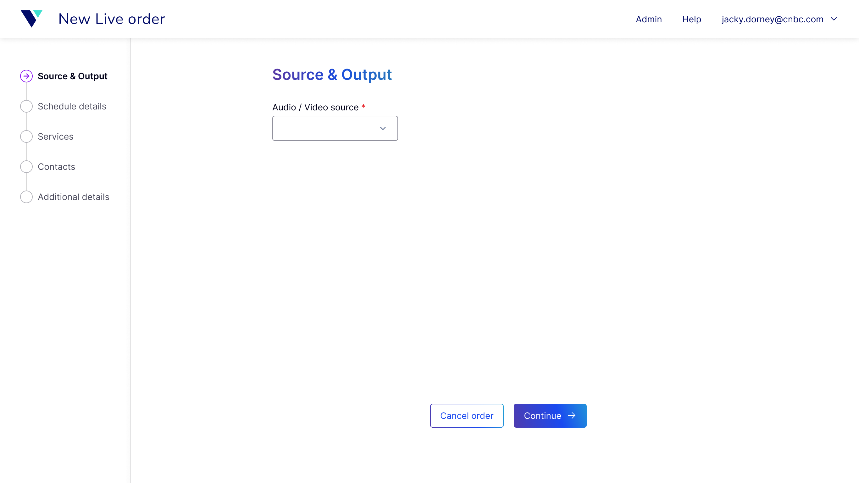
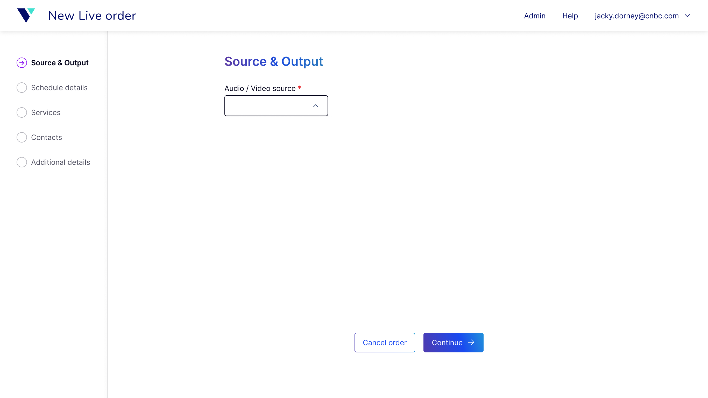
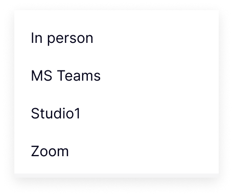
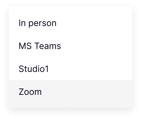
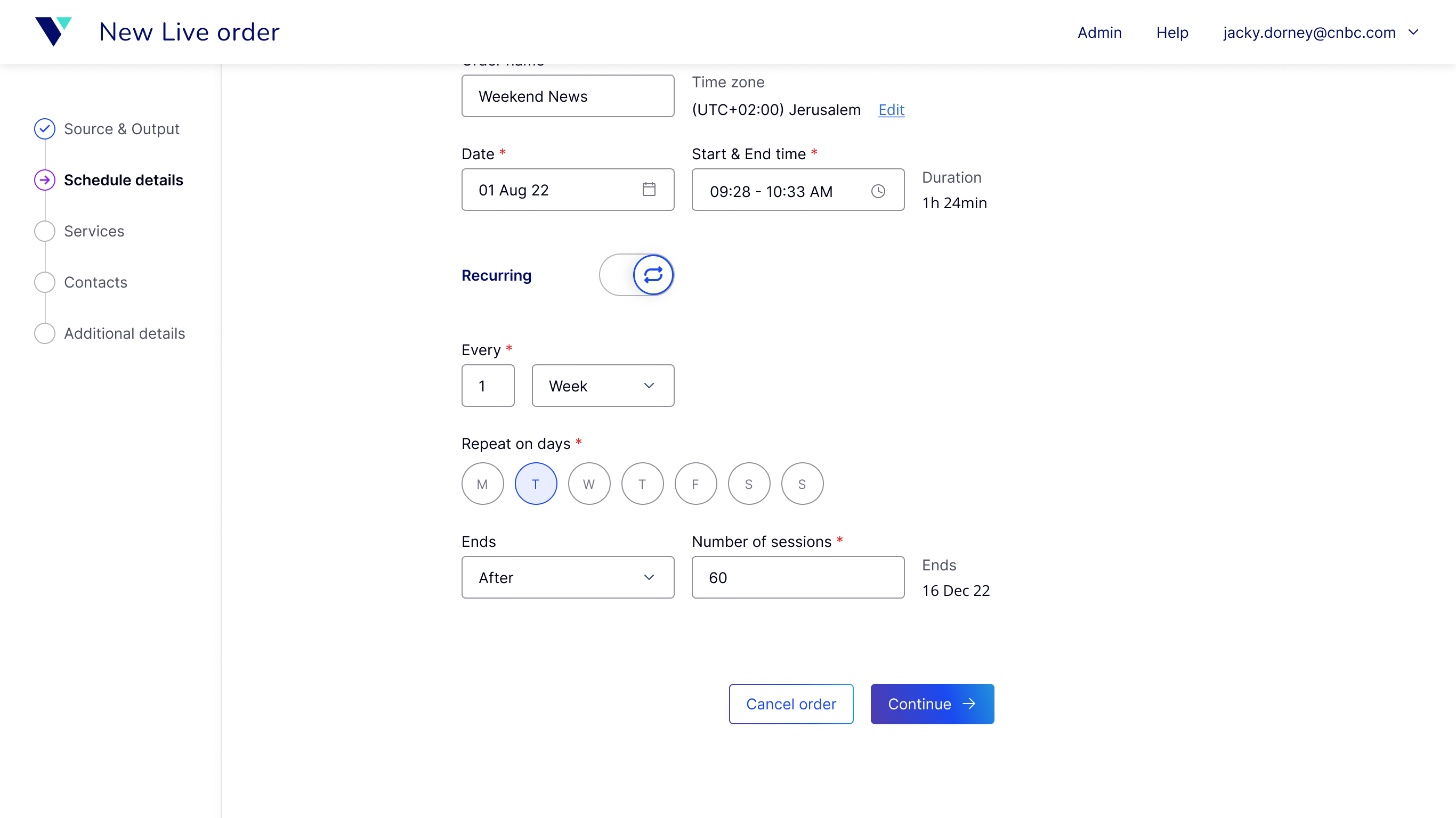
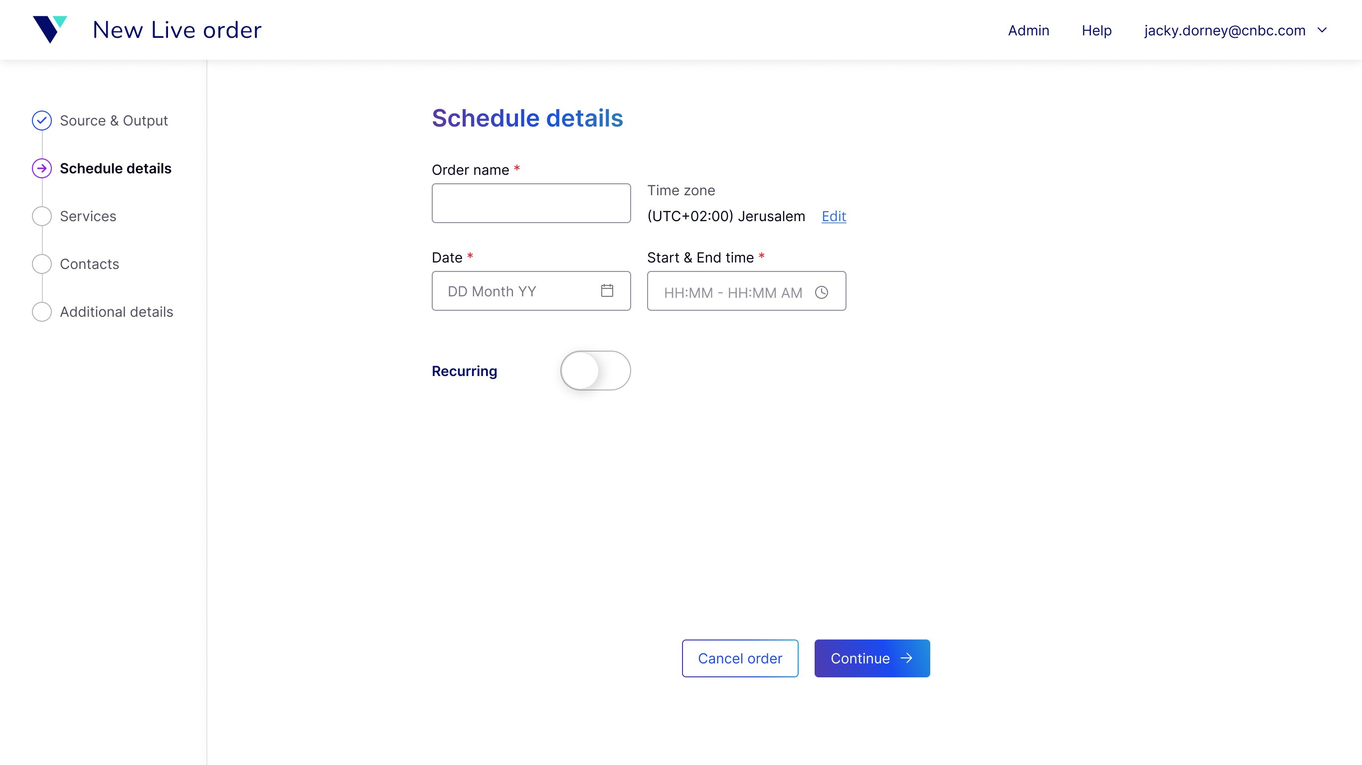
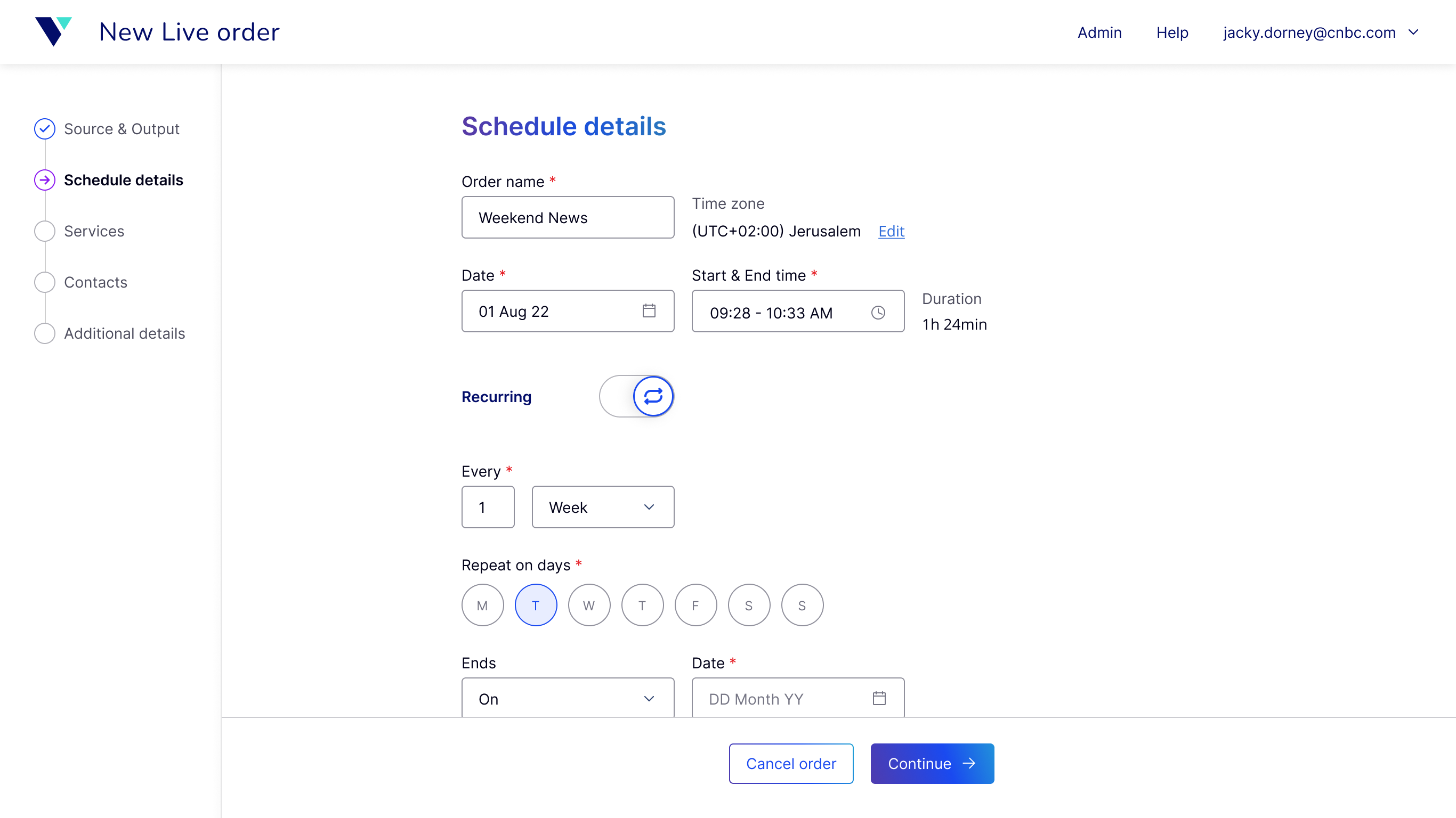
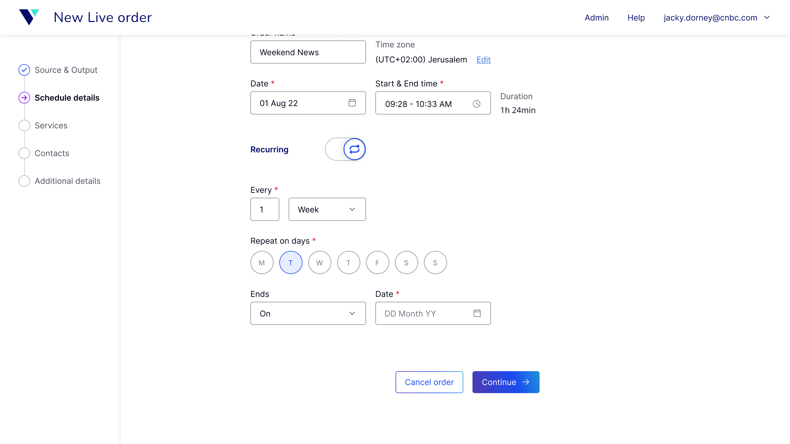
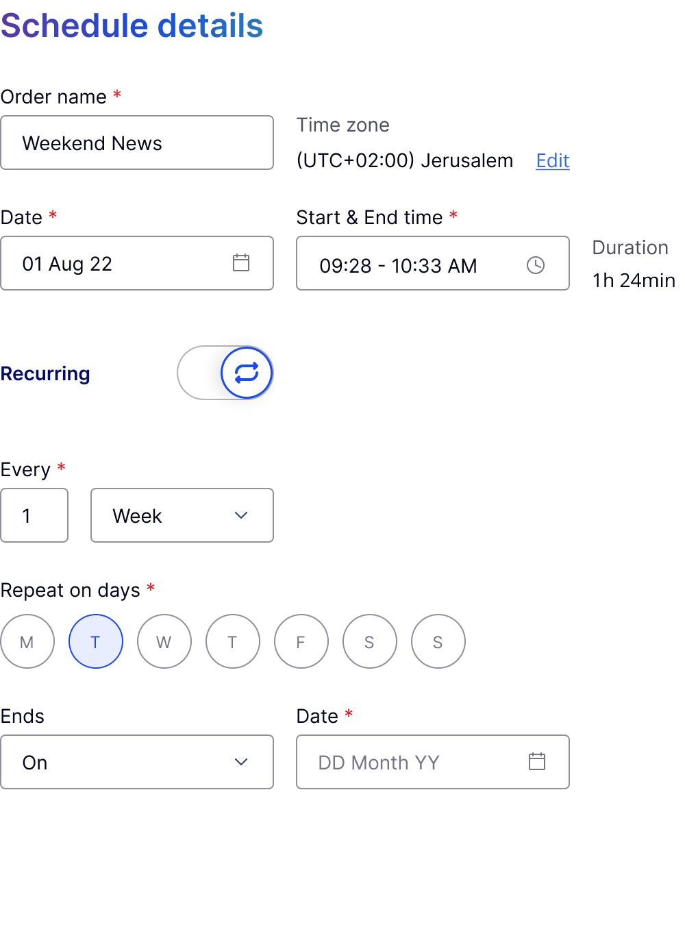



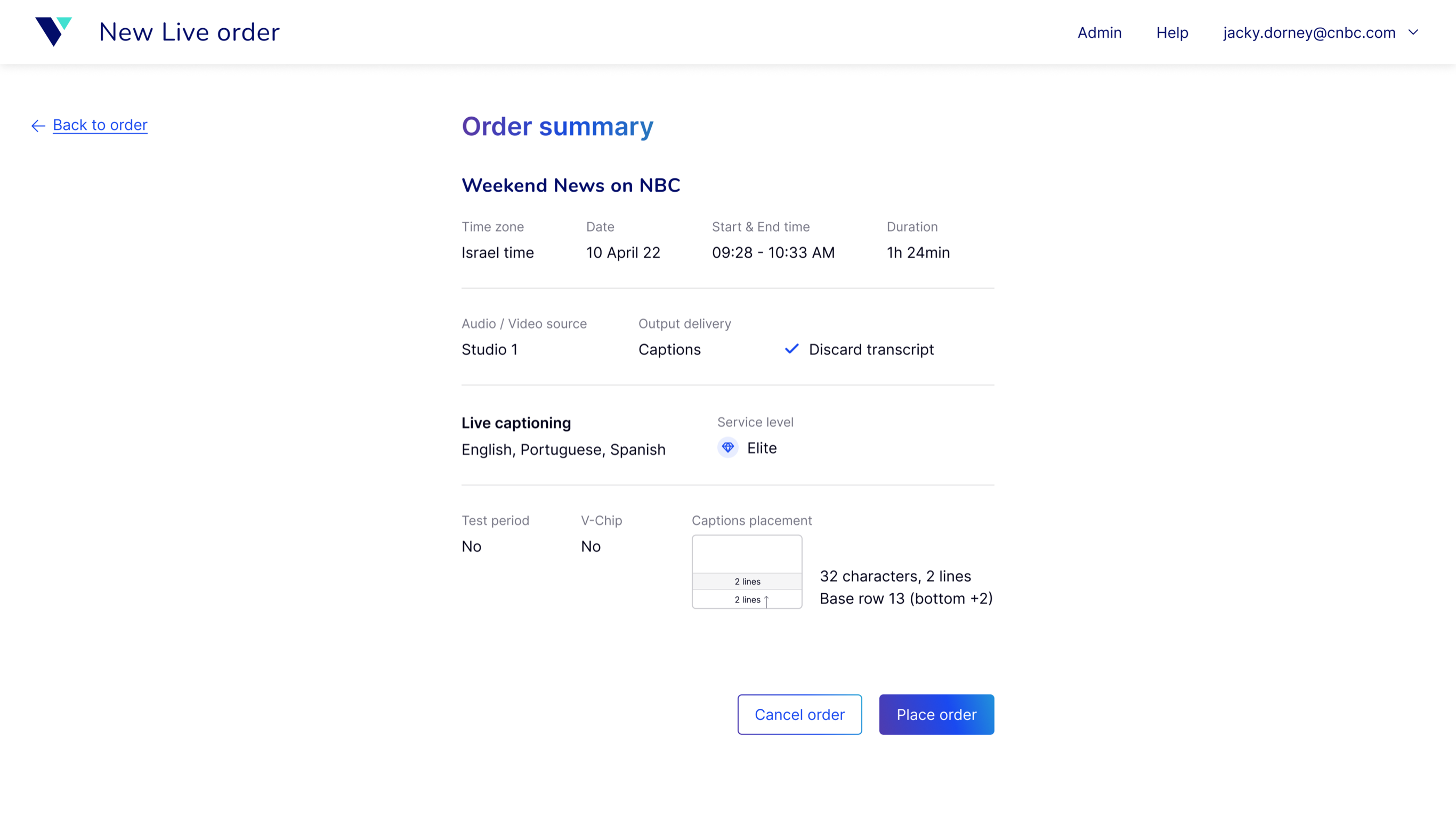
The order summary was moved out of the wizard, giving users an optional final review without adding another required step.
The next test was how it worked for users
When I left Verbit, phase 1 was already in development with the changes validated in usability testing. Phase 2 was fully designed, with a shorter, more adaptive flow that brought Media into the same experience. Stakeholders and domain experts were aligned on that direction.
At that stage, there was no usage data. The next step would be to compare the new and previous experiences using metrics like session-creation time, completion and error rates, support requests, and how often users changed the defaults.